One Minute With… James T. Edmondson
2 Comments
Hi James, thanks for taking time to chat with One Minute With. Tell us a little bit about yourself and your work.
No no no no no Conor. Thank YOU.
I’m almost a graduate of California College of the Arts, living in San Francisco, and I’m the youngest of six boys. I design typefaces and work on lettering projects. I’m a virgo.
Walk us through a typical day in the life of James T. Edmondson?
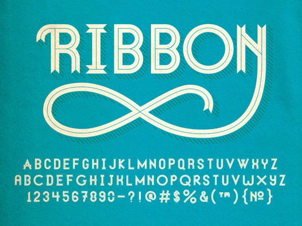
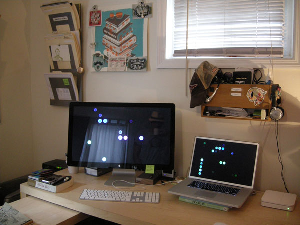
This summer I’m not doing any summer school, or working for anyone. Lately, I’ve been interning with Erik Marinovich, but Erik encourages me to spend a lot of time working on my own projects than a normal intern situation would allow. I’m really lucky at the moment to not have too many client projects on my plate, so I can focus on all these typefaces I have going.
A typical day probably consists of type design, lettering, client work, and some personal things too.
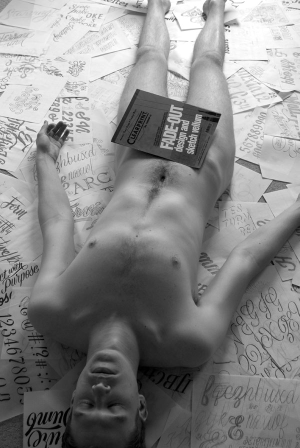
How did you get into design?
This video explains that:
How do you approach a new project? What’s your creative process like?
Of course it varies all the time, and it never goes the way I think it will. A simplified way of looking at it is, doodles, research, sketches, refinement. It’s never as linear as that. My typography I teacher Angie Wang (whom I adore) always told us design is not linear. That’s one thing I love about this job.
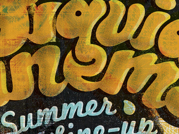
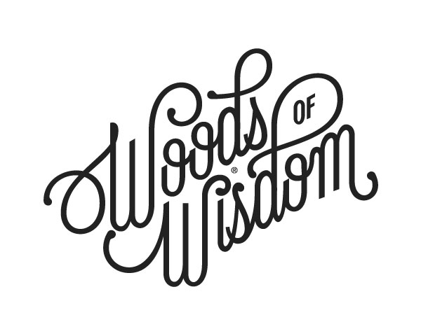
You’ve created some incredible fonts, namely Duke, Wisdom Script and Lavenderia, all of which you distribute on Lost Type. Is it a concern for typographers, especially when you’re allowing anybody to obtain the font for free, that your fonts may become overused, and eventually go the way of other overused fonts like Gotham and Bello (ie. still awesome fonts, but lost their edge due to oversaturation)?
Thank you! I suppose that yes, it is a concern, but it doesn’t really concern me. Does that makes sense? I’m just trying to put out a higher and higher quality product with each release, and I don’t think too much about how the font will be used and abused. One reason for that is I have no way of predicting what’s going to happen, and if I focus on quality, everything will work out in the end. When my fonts are criticized, I try not to beat myself up about it. Wisdom Script was the first font I released—of course it ain’t perfect, but I’m getting better all the time. Gotham and Bello are great because they are nearly flawless designs. H&FJ and Underware sure as hell aren’t beating themselves up for creating something so useful and beautiful that thousands of designers adopt it.
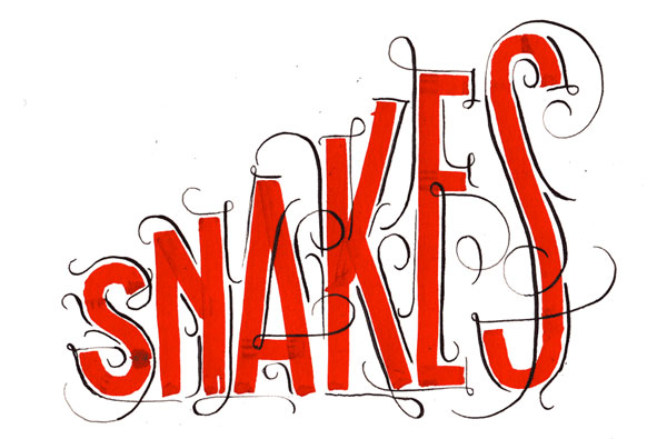
You run a local “Lettering Club”, in which folk get together and draw letters. Have you noticed a resurgence of lettering and calligraphy in recent years? What is it about lettering and typography that appeals to you so much?
Lettering Club might be defunct at this point, but I can say there is a growing number of kids in design school interested in lettering right now. Designers are once again aware of the shortcomings of fonts, and drawing is always going to be fun. Lettering Club was just a way of organizing a class that I wish my school offered.
In school I was looking for a way of approaching a project that worked every time. Graphic Design I and II were really tough, because I’d do well on one thing, then totally eat shit on something the next week. It was an emotional roller coaster, and like everyone else in art school, I was stressed out. Once I started approaching projects the way a lettering artist would, everything worked out way better. I heard God saying, “Do more lettering you dummy.”
If, in some Freaky Friday-like situation, you could live the life of another designer, illustrator or creative, for a day, who would it be, and why?
Jimmy Buffett. I’m such a parrot head.
What design tools could you not live without?
Moleskine notebooks. Faber Castell pens (all the widths, and the soft brush is my favorite). Clearprint design vellum. Soft lead. Scanner. KY. FontLab.

And finally, what tips would you give to anybody who is looking to get started in design or typography?
Draw letters everyday. Merge lettering with your other interests. Experiment with various writing tools. Wear nothing but jorts. Study classic typefaces. Look at calligraphy books, old lettering books, etc. Learn the correct way of building letterforms, so you know how to break the rules.
Make friends in the community. That has been my goal for the past year, and it has made things way more enjoyable. We are all truly lucky to be in this field with such encouraging and talented people to look up to.
Practice if you love it. If you don’t love it, you probably won’t want to practice, and that’s fine! Just find what you love to practice.
