One Minute With…
Matt Chase

Hi Matt, thanks for taking time to chat with One Minute With. Tell us a little bit about yourself and your work.
Thanks very much for having me, Conor. I’m a Kansan-born designer, living and working in Washington, DC. Presently, I’m enlisted in the ranks of Design Army, where I’ve been fighting the good fight for about a year and a half now. Just before landing in DC, I was interning with ad house Crispin Porter + Bogusky in Boulder, and prior to that, while in school, enjoyed a few summer stints at Hallmark Cards in Kansas City. I try to push my work to tap the widest gamut I can, exploring anything from child-like whimsicality to more serious reflections on life & culture. I’ve got an insatiable taste for the irreverent and am always looking to circumvent the obvious. The past few years have really introduced me to illustration, which I only briefly started fooling around with toward the end of my college years, so that’s been a ton of fun.
Walk us through a typical day in the life of Matt Chase.
Pretty normal schedule, really, save for the fact I live in DC, so I probably get offered things like meth and PETA literature more often than most people. I usually get to work around 8:30 and try to catch up on personal things like e-mail / Twitter before settling into real work. I can’t really get into the details of a day at Design Army, but I can tell you that each one is certainly a new adventure. Every person who walks in that door puts their entire life into what we do there, and it’s pretty amazing to see what comes out when we’re done. I usually make it home around 8 or 9, and either dive right into more work or just take it easy. Admittedly, there’s always a project I know I should be doing when I get home, but after after 12 straight hours in the studio, I try and slow things down when I know I need to.
How did you get into design?
For Christmas, when I was in fifth grade, I asked for a scanner and an Ocarina of Time Player’s Guide. I fired it up and the first thing I did was scan the cover and change Link’s tunic from green to red, which it obviously should have been in the first place because the Goron Tunic allows you to walk through volcanoes and looks way more badass. That’s probably about the time I got hooked, although the majority of my academic career was spent under the assumption that I’d ultimately pursue an English degree. It wasn’t really until high school that I realized design could afford me a rare opportunity to mix my passion for writing and my passion for art. Our teacher at the time, whose background was in pottery, was phenomenally underqualified to be heading the new Computer Arts course we just introduced, so my senior year was basically spent making faux album covers for bands I invented and fabricating track names to songs that only existed in my head. It was a good year.
I went on to Kansas University, whose program is amazing, and was introduced to a new world of designing around concepts instead of bands called FunkStain. I got lucky the summer after my sophomore year and netted the last internship spot at Hallmark Cards, where I worked the next two summers, and during the year headed the advertising staff of our university’s newspaper, which turned out to be this crazy, surprisingly beneficial exercise in collaboration. Most of the campaigns we ran were the brainstorm children of myself, the marketing kids and local business owners. Working under those circumstances for so long made communicating and developing concepts with later clients much easier. It was like a little microcosm of the real design world—with real clients and real budgets and real deadlines—but in a student atmosphere, with friends and booze and basketball and stuff. Still being in school, it was great to be able to compare the workings of the classroom environment to all the things the classroom environment was preparing me for—in between my classes.
How do you approach a new project? What’s your creative process like?
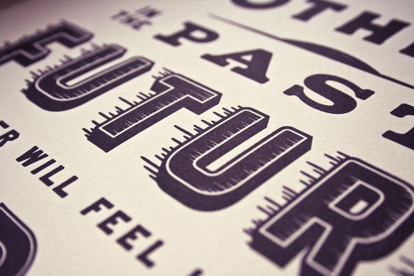
Every project is obviously different, but the first thing I try and do is clear my mind of any assumption I might have about what the client is expecting from me. I’ve found that trying to design around the notion of what you think another person probably wants is needlessly restrictive. But I think a lot of people get caught up in that. It’s like, “oh, well, you probably hired me to do this because you saw this one thing I did—” And while that might be true, you can’t keep your focus there. So, fresh start, always; that’s the first thing. The nature of the work usually dictates the process. For illustration, which comprises the majority of projects I do in my spare time, it’s the idea that I’m after. I’ll do a lot of quick thumbnails, hoping to unearth visual metaphors or clever interactions that speak to what I want the final piece to say. That’s the bulk of the process, actually. I’d say it’s about 80% fiddling around on paper or staring really, really intently at walls while talking to people and 20% finalizing. Computer execution tends to go pretty quick.
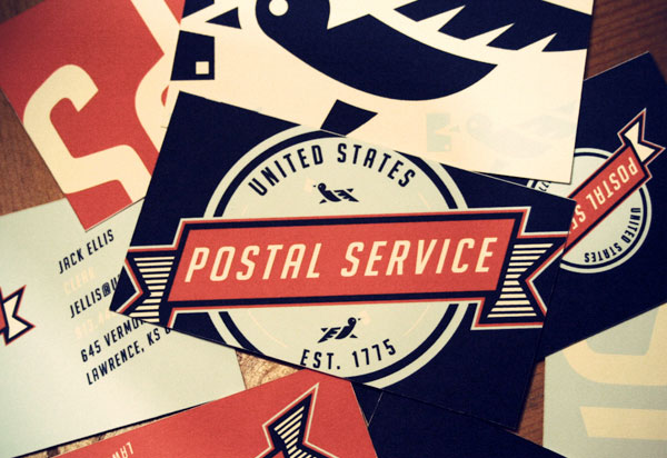
You gained a good deal of attention for your USPS rebranding concept – How beneficial is it, do you feel, to work on self-initiated projects, as opposed to just paid work?
USPS paid me $8 million for that work.
It’s funny you ask though, and a lot of people don’t realize this, but that was actually a school project. Not necessarily in the self-initiated realm, but I think it does address the same kinds of considerations that go into developing projects outside of what you do for clients. There’s no one to answer to but yourself—no deadlines, no budgets, no HR reps to appease. And that’s liberating, big time. It’s basically the workday equivalent of grabbing a beer after 8 hours on the job. Everyone needs that.
One of the first things I noticed when I got into doing this was that it’s a straight-up passion industry—we do this because we love it. We stay up late to draw pictures of bears and letters and logos for things that only exist in our heads. Regular people don’t do that. Regular people sleep. How many accountants do you know who go home and crunch numbers in their spare time? The answer to that question is zero. I would even go so far as to say that if you aren’t doing work just for the hell of it—or if that notion repels you in the slightest—then you might be in the wrong field. We all want to do good work. We crave it, we need it. But at some point, we’ll all be in a position where good work isn’t happening, even with good clients. So you have to find it on your own. If that means making it for no one, then you make it for no one.
Throughout your online presence, there’s a great sense of character – You use humour to great effect on your site. How important is it to be a ‘real person’ in the design industry, rather than just a PS/AI robot?
That means a lot — thank you. I would never presume to say it’s important or not important to be a certain kind of person; I think the only thing that really matters is to be yourself, as high-school-counselor as that sounds. If you care about the work that you do, your personality will come through; it’s inevitable. And people will start to notice.

If, in some Freaky Friday-like situation, you could live the life of another designer, illustrator or creative, for a day, who would it be, and why?
James Victore, probably. More than anyone else I can think of, he embodies this belief that good, powerful ideas should be at the heart of everything you do. I mean, most of his work literally requires the dexterity of a four-year-old, and yet he manages to say things that no masterfully-perfected, digitized wonder of a piece could ever do. And that’s rare. In a world where we so dutifully worship technical proficiency and brilliantly choreographed superficiality, his work always serves to remind me that making something beautiful will never mean as much as making something good.
What design tools could you not live without?
Pretty standard stuff, really. Pencil and paper (whatever’s cheapest), Illustrator, Photoshop, InDesign, e-mail. Google images totally revolutionized research; I can’t really imagine not being able to scroll through a hundred pictures a minute. I love anything editorial-based, so I always keep some kinds of magazines around. I could probably toss my cell phone in a dumpster tomorrow morning and forget I’d done it by noon.

And finally, what tips would you give to anybody who is looking to get started in design or typography?
The biggest piece of advice I can give to anyone is to work hard and love what you do.
The second is to avoid being derivative. Half the design work out there looks almost the same, and at least half of that looks almost exactly the same. It’s what happens when people to look to what’s popular for their inspiration, and stop looking inside. More with the counselor shit, I know, but it’s true. Don’t be concerned with having a style, or what your piece is going to look like when it’s finished. Style is always secondary to substance. You can buy a Ferrari kit car for a quarter of what an original Ferrari costs, and yet the real ones out-sell the fakes two to one. Why? Because a flashy red car on its own doesn’t mean anything; it’s what’s under the hood that counts. You need substance, and you don’t get substance from replicating what everyone else is already doing. Don’t set out to build a better-looking Ferrari, set out to build a better-performing car.