One Minute With…
Dai Foldes
Hi Dai, thanks so much for taking the time to chat with One Minute With. Tell us a little bit about yourself and your work.
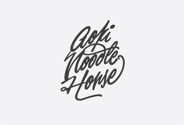
Thanks for approaching me. I make lettering and type from written letter-forms. I do some sign writing as well, of a very unrefined nature. I decided this is what I want to do halfway through my senior year of a painting degree at the Maryland Institute College of Art in Baltimore, where I happily continue to live (I’m 23 now).
Yeah, I’m curious about that – I mean, especially in the US, a university education isn’t cheap. Did you feel that you had wasted that degree, or did the skills you picked up from painting carry over to an extent?
God, getting right to the tough questions… I went to art school for some badly wrong reasons. Only at the very end did I discover the night-and-day difference between a craft in which you have to force yourself to grudgingly throw out something you know isn’t working and one in which you do it without hesitation. I count my blessings: I acquired some phenomenal mentors and friends who continue to guide me when I ask for help. I can wield a brush and pen in ways that distinguish me from many designers. I think I’m only beginning to translate my tastes in painting into flat design so we’ll see where that leads.

Going right back to the start, how did you get into design, art, and, well, creative pursuits in general? Was there a defining point in your career, and if so, how did it shape you as a designer?
I drew and painted throughout high school. I was no better at it than I was at math or science but a lot of people in my school were good at math and science and we all learned the same things and got the same high grades. Art, I felt, was the better opportunity to get a head start on a career. You put in extra work, your results were more impressive.
At MICA though, I saw how often bullshit is substituted for craftsmanship (and for criticism) in the professional art world. Too stubborn to drop out, I pleaded my way into the brilliant teacher Ellen Lupton’s Design I class, where I could never settle on fonts for wordmarks so I would draw them myself. People told me that’s a thing you can do. Again, I pleaded my way into the Type and Lettering class with House Industries’ Ken Barber and Ben Kiel. That was it. Watching Ken draw letters was like seeing god. Ben nitpicked the tiniest details. Scientific, historic rules and sexy technique? I wanted this for myself.
If you could change one thing about your career to date, what would it be?
I’m making up this “career” as I go along so I really have no excuse for being wistful. I decided I should know more about Open Type functionality so I’ve made it a big part of the script font I’m working on right now.
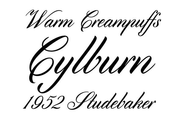
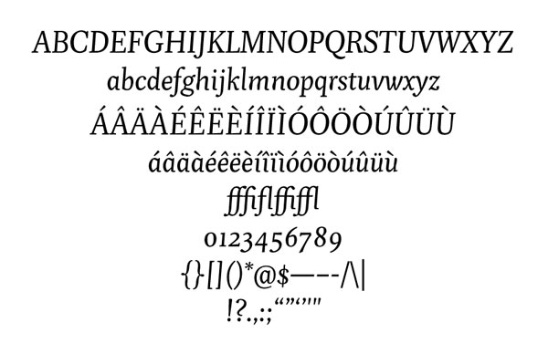
So I guess a lot of people will know you from Pigeon and Cylburn, two lovely fonts that are decidedly different from each other – How does the creation process of serif and script fonts differ? What new challenges did each bring, and which process did you personally prefer?
To be honest, I started with a serif because it was my first typeface. It was quite enough, learning about spacing, color, harmony, and the software without reckoning with the logistics of a script.
What Pigeon and Cylburn have in common is that they are both derived from writing. That is, the execution of letter-forms in one pass of a tool as opposed to the built-up drawing of lettering. I think it’s easier to treat non-script forms as a canvas for the quirks and gestures of handwriting because the basic forms to which we are accustomed are already so abstracted from their handwritten origins. Most scripts, however, depend on shockingly unyielding formulas which, to my mind, are difficult to take liberties with and get back something good. I’m not sure why that challenge appeals to me so strongly. The calligraphic work I love most doesn’t presume to break the rules. It’s instinctively conscious of them while appearing rakish and facile. That’s the kind of mastery I want in all my work, eventually.
And outside of other graphic design, what inspires – or at least influences – your work, do you think?
I tend to develop extremely strong, almost codified opinions on matters of taste as soon as I begin learning about them. I have a clear idea of the perfect motorcycle but I don’t build motorcycles so that’s not really fair. I do cook a lot (in lieu of rent at the office where I co-work, in fact) and I aspire to cook like a grandma rather than a Food Network chef. Be economical, rely on experience and love rather than fancy ingredients or weird fusions, never apologize. Something else: I took up Lindy Hop last summer and by fall I knew exactly how I wanted to look on the floor. Aside from the qualities everyone wants like nonchalance and the ability to play with expectations of rhythm (I think Bram de Does spoke about the “swing” in Trinité – one of my favorites), I want to be all about making my partner (read: users and clients) look good instead of showing off.
I don’t think that these things and my work really inform each other so much as they are simply driven by the same overarching personal values but that’s the best I can do.
If, in some Freaky Friday-like situation, you could live the life of another designer, illustrator or creative, for a day, who would it be, and why?
Someone funny. Michael Palin during the days of Flying Circus. I keep a journal of comedy sketches I wish I could produce.
How would you define success? Do you think you’ve found it yet?
Based on your interviews with people I consider far more successful than I am, success is illusory. That said, I’d like to support myself primarily on self-initiated projects rather than client work.
And finally, what tips would you give to anybody looking to get started in design?
This is a video of Ira Glass advising beginners in creative fields. His observations have remained powerfully important to me since I first heard them a few years ago.