Author Archives: Conor O'Driscoll

About Conor O'Driscoll

Conor O'Driscoll is a designer and writer, who writes for AppStorm.net. He also enjoys writing about himself in the third person.
  1. One Minute With… Andy Luce

    Leave a Comment
    Post - Andy Luce Interview

    Hi Andy, thanks for taking the time to chat with One Minute With. Tell us a little bit about yourself and your work.

    Conor, thank you for having me! I’m a letterer, designer and artist for a living – and a guy who loves to spend quality time with family, friends, my girl and go on adventures outside whenever possible. I’m currently traveling throughout Europe for one year with my wife, while freelancing on select projects. Prior to leaving for our trip, Chicago had been home for the last five years. My work and work ethic have been hugely influenced by the Midwestern mentality and character. There is an underlying goal in the Midwest to make things that can be truly experienced and used, not just looked at from afar. I take that approach seriously in my work and aim to create work that’s ready to be experienced.

    How did you get into design? Was there a defining point in your career, and if so, how did it shape you as a designer?

    I’ve always loved art, and I’m sure I have similar stories as my colleagues – drawing logos of my favorite baseball teams, botching illustrations of Chewbacca, and so on. Design offered an avenue to combine a variety of art practices into one medium and I was drawn to that early on.

    So far in my career, two defining moments come to mind. The first was getting laid off in the 2008 recession. I was working at a Chicago-based agency that folded in the poor financial climate, and I found myself one year out of college without a job in a market that was not looking to hire. In the midst of an awful situation, I was offered a job working with Firebelly Design, and I took it. To this day, it was one of the biggest blessings and influences in my career. Dawn Hancock, owner of Firebelly Design, has been a mentor, friend, and a dear colleague ever since.

    The second was in the midst of a project at VSA Partners here in Chicago. I was put on a client project (to be left nameless) and was asked to extensively research and sketch script typography for the client. I’d already been exploring calligraphy on a personal level, but this project was the first time I sincerely attempted lettering, and I loved it immediately. In many ways, it came naturally and that project was the launching pad for my career in type and lettering.
    Andy Luce Interview

    If you could change one thing about your career to date, what would it be?

    Honestly, I wish I’d established myself more as an editorial illustrator right out of the gate. I have a passion for illustration and I’m able to use it daily within the realm of lettering, but I’d love to illustrate more for clients.

    A lot of your work seems wonderfully effortless – as if you simply threw some ink down on a page, it happened to form lovely letterforms, and you called it a day. To what extent is that true? How much of your process involves iteration on a project-by-project basis, and how much of it is simply practicing to get to a state where you don’t require as much iteration?

    First, thank you for the kind words. Within my work, the calligraphy-based pieces in particular, there’s an incredible amount of trial and error. Granted, I practice regularly, and I know what to expect with the ink, but no one ever sees the mountain of paper that goes into the recycling bin in an effort to achieve ideal, balanced pieces. The final result may look somewhat effortless, but it definitely takes time and effort to get it just right.

    Furthermore, I always try my best to treat each project individually to make sure I’m creating a piece that’s memorable and special – so working with each client project by project has proven to be the process for me.
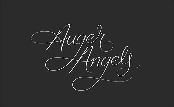
    Auger Angels - Andy Luce Interview

    And as well as your lettering, you do some lovely semi-abstract artwork. Do you view one as an extension of the other, or are they, to you, two entirely different beasts? What sorts of challenges do each pose?

    I’ve learned techniques in the midst of painting a canvas that I’ve been able to bring into a client project and vice versa. I challenge myself to try new things as often as I’m able. Working abstractly allows mistakes to become textures and layers, and in the end, not a mistake at all. That mentality has transitioned into my lettering work: building letterforms up, taking away bits and pieces, and then approaching the composition in a new light. I really believe that lettering and painting balance and feed off each other, and they work hand in hand.

    As far as challenges, knowing the moment when a piece is finished – when to stop and when to push it further, that’s always the challenge.

    Outside of other design and illustration, what sorts of things inspire and influence your work?

    My wife and I are currently taking the year to travel throughout Europe, the Basque country of Spain and France in particular. This has had a profound impact on my approach to design as of late. The signage, storefronts, and the overall approach to life that people here hold is so different versus back home in the States. It’s quite refreshing. Beautiful, actually. I’ve made a habit of walking in the mornings, bringing home a baguette and 2 pain au chocolats for breakfast. I use this time to soak up type. In the Basque region for example, each family home has a name, an etxea, and that name is proudly displayed on each home – by the front door, over the gate, or along the stone fence. The name is often painted – but sometimes, the type is a wrought iron script in the fashion of neon. The legacy of type here is so rich, and I’ve noticed that it’s creeping into my work, and I like that!
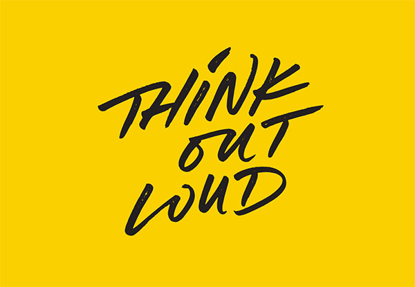
    Think Out Loud - Andy Luce Interview

    If, in some Freaky Friday-like situation, you could live the life of another designer, illustrator or creative, for a day, who would it be, and why?

    There are countless creatives that I truly admire, so this is a tricky question. If I had to narrow it down to just one, I’d have to say John Passafiume. I love the character of his work – how it can dance between timeless, charming, and downright beautiful. I’ve seen it written that he’s the “next” Doyald Young and I agree with that sentiment. Not only is his work truly top shelf, but he spends his days with Louise Fili, who I also find unbelievably inspiring.
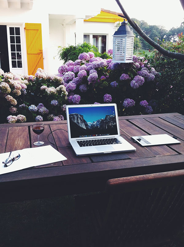
    Travelling Workspace - Andy Luce Interview

    How would you define success? Do you think you’ve found it yet?

    Professionally, as long as I’m able to passionately work with great people, create daily, and live a balanced life in and out of the studio, I feel successful. With that, I’ve certainly found success some days, and failed miserably others. Spending time with my wife, sharing a good beer and conversation with a pal, or going for a nice run helps me sleep just as well at night as finishing dream projects that I aspire to work on.
    Thank You - Andy Luce Interview

    And finally, what tips would you give to anybody who is looking to get started in design?

    My sincerest advice to newcomers would be twofold – be honest and be authentic. I’ve always made an effort to have relationships first and colleagues second. People go to bat for their friends, and at the end of the day, we all want to work and invest time with good people.
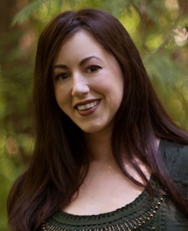
    Thanks Andy!

    Many thanks to Andy for talking to us. I really enjoyed his answers, and hopefully you did too!
    Why not check out Andy’s site, and follow him on Dribbble and Twitter?

    Related Posts:

  2. One Minute With… Laura Worthington

    Leave a Comment

    Courtney Milan Logo - Laura Worthington Interview

    Hi Laura, thanks for taking the time to chat with One Minute With. Tell us a little bit about yourself and your work.

    I’m a full time typeface designer, all of my designs fall under the realm of display type. I was a graphic designer for 15 years before I got into typeface design and I officially made the switch from graphics to type in September of 2010. Graphic design was close to what I wanted to do as my “dream career” but I found myself more interested in creating the elements rather than the arrangement of them. And I had gotten into graphic design in the first place as a means to doing more lettering, so type design ended up being a natural evolution of my career path.

    How did you get into design? Was there a defining point in your career, and if so, how did it shape you as a designer?

    My father that pointed me in the direction of graphic designer. He understood my passion for calligraphy and lettering and thought a career in visual arts would be the right thing for me. As for getting into type design, that’s a longer story. I became friends with Charles Borges de Oliviera, who was a graphic designer and lettering artist who had designed a couple of script typefaces. He kept encouraging me to design a typeface of my own, and I finally took his advice. As soon as I became involved in the process, I knew that type design was “it” for me, and I began moving in that direction. I was determined to become a full time type designer, and within ten months, I was!

    Laura Worthington Interview

    If you could change one thing about your career to date, what would it be?

    I wish I could design faster and have more hours in the day! I have all of these ideas, but there’s never enough time for all of them!

    A lot of your typefaces are either scripts, or directly influenced by script forms. Is this a niche you intentionally tried to establish for yourself, or did it simply evolve naturally from a love of script forms? Would you ever want to design, say, a geometric sans-serif, or are you content sticking to your tried-and-true style?

    It happened naturally, came from my love of traditional calligraphic forms and penmanship, though I’ve tried to branch out from it too. You can see that with my newest family, Charcuterie. It’s a collection of 10 different typefaces, only one of which is a script. In the future, I plan to try different type design styles, and at some point in time, to design a text family.

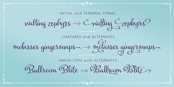
    Harlean - Laura Worthington Interview

    But not only do you design typefaces, you also do a bit of lettering too – How do these two disciplines compare? If you could only do one of these for the rest of your career, which would it be, and why?

    When I’m creating lettering as a basis for type design, the process isn’t as clean or structured as it is when I’m creating lettering for say, a headline or a logo. Lettering for type design is experimental and kind of all over the place. I end up scanning in a bunch of random words, phrases, letters, symbols, etc. Just kind of a big jumble of stuff mixed in with random sketches and notes. I then make sense of it all in the computer.

    The process I use for lettering a headline, title or logo is very clear and defined. The first phase is research and sketches, then drawing of pencil skeletons and planning of the composition, then several pages of vellum or tracing paper of lettering with a brush, ruling pen or a flexible nib, each a refinement or slight change in direction from the last page. Then it’s scanned and redrawn in the computer.

    I prefer type design over commissioned lettering projects. Type design is self directed: I get to call of the shots and everything is done on my own terms. I develop the concept, experiment with different methods and create whatever I want. Lettering for commission is client-directed and whilst I have worked with talented clients and art directors, I have had enough experiences that have been less than fun, where I’ve ended up just feeling like a pair of hands. However, with that said, my work life would be pretty boring if it was ALL type design and I would miss the challenge of commissioned projects, so I try to keep a mix of it – right now it’s about 85% type design, 10% lettering and 5% teaching workshops.

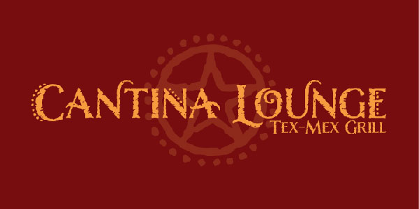
    Cantina Lounge - Laura Worthington Interview

    On your site, you say that you have worked for “large and small design studios, agencies, and in-house creative departments.” – What challenges did each of those bring? Do you think you’ve found a working environment that suits you now?

    When I worked at large design agencies, I got to work for well-known companies, but found that I was only a very small part of the process, so while the work was glamorous, my part in it oftentimes wasn’t. With small design studios, it was the opposite. The clients weren’t always well known, but my part of the work was much more substantial. With in-house design, there was a great amount of control of the outcome, but the work could be tedious and boring. I figured out, very early on, that I thrive in an independent work environment. The only thing I miss is having co-workers to bounce ideas off of and to keep me company, but I make up for that now in other ways. Sometimes I have my design friends come to my home studio for a work day, or I go to their place. I also have my dogs to keep me company. Overall though, I absolutely LOVE working for myself at home. I’ve been at it for eight years now and see this as my permanent work situation.

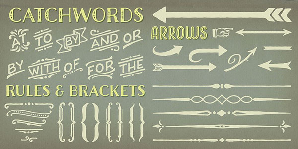
    Charcuterie - Laura Worthington Interview

    If, in some Freaky Friday-like situation, you could live the life of another designer, illustrator or creative, for a day, who would it be, and why?

    Landscape architect. When I was young, I spent a lot of time helping my family with gardening and landscape projects and worked at a greenhouse during college. I also studied scientific illustration. I love gardening and creating outdoor space plans (I’ve drawn some pretty elaborate ones up in Illustrator).

    How would you define success? Do you think you’ve found it yet?

    That’s a REALLY good question and one that, for me, has been a moving target and has caused some unhappiness in my life from too narrow of an interpretation of it all. For my career, if I feel like I’ve pushed myself to try new things, have designed something that is of value to others: useful, practical and beautiful, and have upheld high technical standards: published a quality product, then I’ve been successful. For my personal life, if I’ve been a good friend and family member, have produced more than I’ve consumed and have always tried to be a better person, then I’ve been successful.

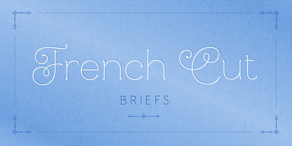
    Mandevilla - Laura Worthington Interview

    And finally, what tips would you give to anybody who is looking to get started in design?

    For type design, study the market. Look beyond the trends and see where your own personal style can add to what is useful, well-designed and of aesthetic value, and bring it! There’s always more room for quality design. Take your time and realize that it will be a big investment of time. Even if you don’t finish a type design, there is a lot of value in giving it a try and the time spent will go a long way in making you a better designer.

    Thanks Laura!

    Many thanks to Laura for taking some time to talk to One Minute With. I really enjoyed interviewing her, and hopefully you enjoyed reading it!

    Why not check out Laura’s site, and follow her on Dribbble and Twitter?

    Related Posts:

  3. One Minute With… Hannes von Döhren

    Leave a Comment

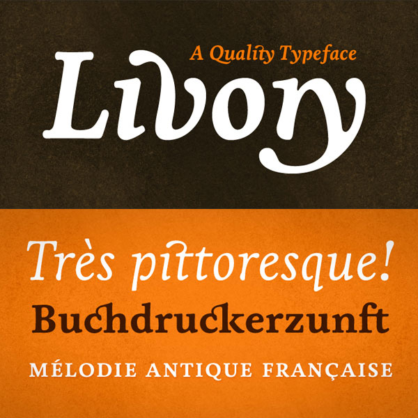
    Livory - Hannes von Döhren Interview

    Hi Hannes, thanks for taking the time to chat with One Minute With. Tell us a little bit about yourself and your work.

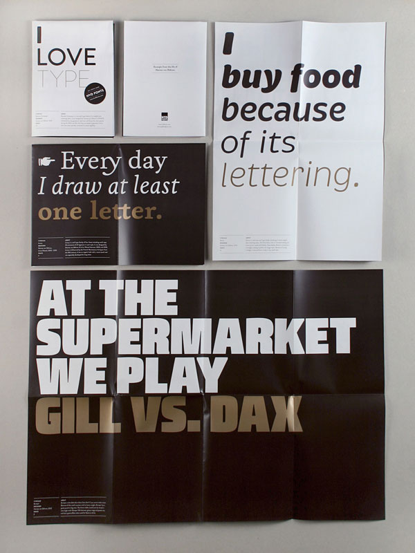
    Hi Conor, glad to be a part of One Minute With. I am a type designer from Berlin/Germany. I run my own type foundry – HVD Fonts – where I create retail typefaces, custom typefaces and logo & lettering stuff.

    How did you get into design? Was there a defining point in your career, and if so, how did it shape you as a designer?

    Like many designers, I have always been fascinated by nice visual things and by the use of type. Typography was my main reason for becoming a graphic designer. Gradually, my love of typefaces has become more and more of an addiction. I started by designing experimental typefaces for fun in my spare time, alongside my job as an art director, making them available as free fonts on the Internet and using them in personal projects. Playing around with type was such great fun that I became seriously interested in the workings of fonts: their technology, rules and background. I got more and more into type design – it was a kind of floating process until I decided to concentrate on type full time in 2008. Since then, I’ve done this everyday: It is both my job and my love.

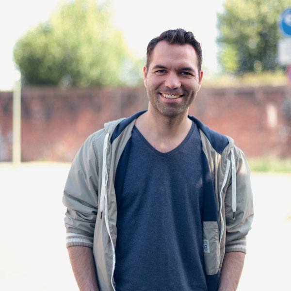
    Hannes von Döhren Interview

    If you could change one thing about your career to date, what would it be?

    When I look back, I have the feeling everything went like it should be. My first years of trying to be a professional type designer weren’t that easy – I put so much work in it and there wasn’t very much coming back. There was even a time where I had doubts about my decision. Type was always my love and I would have never stopped it – the doubt was about the decision to try to live from it. Fortunately the bigger part of me was convinced of my vision and I didn’t give up.

    Today, I think it was good that the success didn’t come directly. It was also good that I had my doubts, and it was good that I nevertheless stayed on my route.

    So, as well as your hugely successful typefaces like Brandon Grotesque and Pluto, you’ve also made a bunch of more lighthearted display faces, such as Blow Up and Shelton – How do the two differ? Do you enjoy the creation of these display faces more? Are they easier? Harder?

    When you are doing a big type family with 20 or 30 styles it is always a very long process (6-12 months, sometimes even longer). It is very challenging but sometimes also grueling. I did several big families and when I had finally finished the project, nearly every time I thought: “Oh man, I am happy this project is finally done and I will never do such a big project again!” This feeling lasts for two or three days, then I am back in business – I still have so many ideas I want to realize.

    To make a small typeface – with one or two weights – is like a little holiday from the “big stuff” for me. I still love experimental small projects and I don’t want to limit myself to just developing big serious type families. So it is a fun-thing which I enjoy a lot. But when I’ve finished a small fun font, I often feel like taking on a new bigger challenging project again.

    To do both is a perfect variation for me.

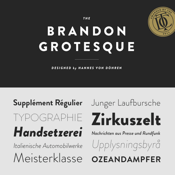
    Brandon Grotesque - Hannes von Döhren Interview

    At what point do you know you’re ready to ship a typeface? Is it ever a struggle to let go, and to what extent do you continue to work on it after the release?

    I can let go when I have the feeling that everything fits. The typeface has to be homogeneous and bring out the attitude I had in mind. To finish a typeface always takes longer than planned. When I am in the end of the process and I think: “Yeah, just one more week – then I am done!” It always takes three more weeks to have all the little things perfect. But then I can let it go – when it is released I see it as a finished project – People are using the typeface, so I think it would be confusing to do a lot of updates or release new versions of it.

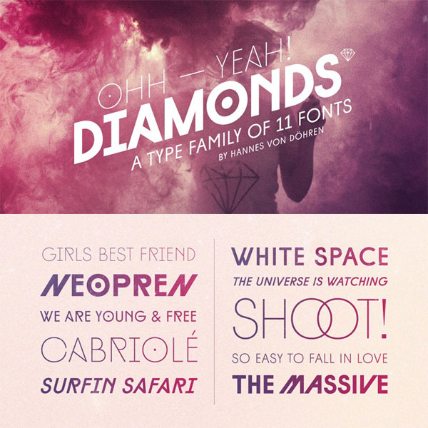
    Diamonds - Hannes von Döhren Interview

    Earlier in your career, you released a load of fonts for free – How important is it, do you think, to give back to the community that fostered you? Would you ever consider releasing free fonts these days?

    I am really happy that the type community supported me as an independent young type designer. I always think of ways to give something back to the community, like giving some weights away for free or giving a discount when a typeface comes out, so every type nerd can afford my fonts if he keeps his eyes open. On the other hand, I want to make it clear that my work has a certain value and that I put a lot of time into it. I live from selling my fonts and I also see it as an act of respect to buy fonts when you use them for commercial purposes.

    Free fonts and retail fonts are generally two different things for me: You don’t have to pay for free fonts and they are nice to set a private postcard or a birthday invitation in. Sometimes you will even find a little free font gem. If you want to have a professional quality product with all its advantages – language support, well drawn forms, OpenType features, cross platform working, clarified user rights … etc. – you should go with retail fonts.

    I Love Typography - Hannes von Döhren Interview

    If, in some Freaky Friday-like situation, you could live the life of another designer, illustrator or creative, for a day, who would it be, and why?

    I haven’t thought about this in recent years, because I enjoy my job so much at the moment. At the beginning of my career, when I was younger, there were times when I thought about this – I had my heroes that I would love to exchange shoes with for one day, like Erik Spiekermann, Adrian Frutiger, Zuzana Licko or Stefan Sagmeister … to name just a few. I still really respect all of them, but I’ve found my own way now.

    How would you define success? Do you think you’ve found it yet?

    I always set goals for myself which I wanted to reach. My first goals were to create a font I could sell or to to have my own type foundry, then I wanted to win in the TDC and worked several years for this, or I wanted to reach the #1 for at least one day at MyFonts. I worked towards those goals thinking everything will be different when I am there – but the funny thing is: Nothing changes. It stays like it was before, so I recognized that there isn’t a point in life where you are finished and have success. It is more like a never-ending journey – the feeling of success is good – it is a kind of an engine. You can either have a small success just to help someone at the bus stop and earn a smile or a huge success you worked for half of your life for. I am happy how I live my life – that is my daily success.

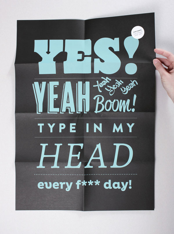
    Yes - Hannes von Döhren Interview

    And finally, what tips would you give to anybody who is looking to get started in design?

    Always be curious. Try things out. Work hard and you will be good. Be brave. Follow your ideas when you are convinced of them. Be positive. And most importantly: Have fun!

    Thanks Hannes!

    Many thanks to Hannes for sharing his thoughts with OMW. I genuinely had a lot of fun interviewing him, and I hope you enjoy the interview as much I do!

    Why not check out Hannes’ site, and follow him on Dribbble and Twitter?

    Related Posts:

  4. One Minute With… Joe Prince

    Leave a Comment

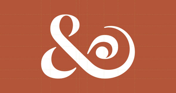
    Ampersand - Joe Prince Interview

    Hi Joe, thanks for taking the time to chat with One Minute With. Tell us a little bit about yourself and your work.

    Hello Conor – thanks very much for taking interest in my work. It’s always nice to hear others appreciate the art of the craft, whether it be for logos or typography.

    Design is a universal thing that can be shared and interpreted by any race or age, which makes it beautiful – That’s one of the reasons why I have always been fascinated by design. From as far back as I can remember, I have always had a black-and-white personality; something that comes across in my designs. This mentality has led to a simplistic style that I developed over the years, in both logos and typography. One philosophy that is important to keep in mind when trying to achieve a simplistic and minimalistic style is that just because it’s simple doesn’t mean it’s good. Just as there is a difference between colorful designs that clash, and colorful designs that harmonize, there is a difference between simplicity and blandness, especially in typography.

    How did you get into design? Was there a defining point in your career, and if so, how did it shape you as a designer?

    How I got started is sort of an ironic story – one might say it’s funny. This is how it all got started: About 7 years ago, I got caught in some bad drugs while I was in high school. I was 16 at the time and started hanging out with the wrong crowd, going to parties every weekend and getting into mischief. The drug usage got really heavy and the caliber of drugs I started experimenting with was really bad. My black-and-white personality contributed nothing but trouble to this lifestyle, because once I started, it was hard to stop me.

    Long story short, this went on for a few years and before I was 18, my parents sent me to rehab. I was there for a few months, was supposed to find a “higher power”, and was on my way – The last time I used drugs was December 24th, 2007, so my official clean day is Christmas Day of 2007. While I was in rehab, I needed something to do to occupy my time and take my mind off the drugs, so I started sketching designs (shirts, logos, etc.) just for fun. After I was back home from rehab, I continued sketching and have never looked back since.

    Joe Prince Interview

    If you could change one thing about your career to date, what would it be?

    Well as a precursor to answering this question, I want to say that I am a full-time college student studying mechanical engineering. I have a little over a year to go to get my Bachelor’s degree, and then I will continue shortly after that for my Master’s. Design is something that I do as a side-job, and it fits perfectly with my constantly-changing school schedule because I can make my own hours. If I have to work late into the night or need to take a day off to study, it’s not a problem at all. Finding a balance between engineering and design is a battle that I have faced for the past few years, because I am passionate about each of them. Ultimately, I hope to combine my two loves into one career, where I can use my artistic and mathematical skills to do something that benefits mankind. To go back to the original question, I wouldn’t change one thing at all. I’m a firm believer that things happen for a reason. Even if, at the time, it doesn’t seem logical or fair, in the long run it all maps out nicely. I could be dead right now and not have design or engineering in my life. I’m one lucky person.

    So, you’ve designed a bunch of typefaces specifically for use as part of Google Web Fonts – What’s that process like? What extra factors need to be taken into consideration when you’re building a font specifically for the web?

    The Google Web Font project was something that I got involved with sort of inadvertently. Several years back, I designed a font called Maven for a company I was working for at the time. It was a small company consisting of myself and three other web designers and coders. We released Maven through the website as a means of attracting customers and getting more hits. This actually worked quite well, and we were getting a lot of good clients. Since this was the first font I ever created, however, there were several things fundamentally wrong with it. For starters, the bold and thin versions consisted of uniweight strokes and for some reason I neglected to clean up the dozens of random nodes. I thought that the font creation programs imported the characters from Illustrator and “magically” cleaned them up, so I figured I didn’t need to waste time doing that. About a year after Maven was released, I decided to revisit the typeface as I had learned a lot about typography during that time simply by studying other fonts and being observant anywhere I went. After all, I think it’s nearly impossible to go anywhere without seeing some form of lettering. So I undertake the process of redesigning Maven from the ground up, improving on things such as optical balance, letter pair cohesion, and spacing/kerning, amongst other improvements. After I was all finished with “Maven 2.0” I decided to publish it under the name Maven Pro. I filled out a proposal with some font specimens for Maven Pro and sent it off to Google, in hopes of working with them on webfonts. Long story short, I was contacted by one of the representatives who was overseeing the project and began designing new fonts.

    One of the main differences between designing for web and designing for print is that hinting must be taken into consideration for webfonts. Even if a character looks perfect and is fundamentally sound, it may have to be adjusted for 12pt or less implementation as horizontal crossbars can shift a pixel and make the character look odd; serifs may grow (or shrink) based on the pixel fitting, etc. This is a crucial methodology for creating webfonts, because if it doesn’t end up rendering well on the web then it is as useful as a Ferrari with no steering wheel.

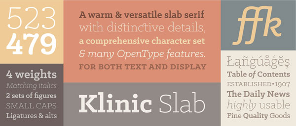
    Klinic Slab - Joe Prince Interview

    As more and more of your typefaces are released, I’m beginning to notice your signature throughout them – Despite them being unique, distinct typefaces, many of them feel decidedly “Joe Prince-y”. Is that intentional? Do you intend to weave a common voice throughout your work, or is it merely a nice side effect?

    Developing a style – or a signature, if you will – is not something that a person decides to “just do”. It is something that develops over time as a way of utilizing similar techniques and processes that they have learned, and returning a final product that is representative of those traits. Depending on what style a person develops, I feel that it can be either really extraordinary or really repetitive and menial (in a bad way). I’ve never noticed that I have a developed style in my typography, but I hope it is a style that others find attractive and useful if it is indeed present. Perhaps it is my innate sense of geometrical forms and keen eye for symmetry that have transpired over the years through my engineering courses that lend to this style. All of my fonts and typefaces have a somewhat simplistic and geometric feel to them, which is something the Swiss have learned to do quite well (Helvetica especially – you beautiful bastard, Max). I am very fond of the Swiss style of design – a less-is-more philosophy. One day, I hope to transform into a Swiss typographer, kind of like a caterpillar turning into a moth (a moth that can move nodes around a blank canvas and make an appealing design.)

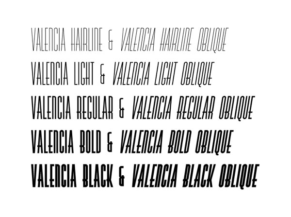
    Valencia - Joe Prince Interview

    I guess, to grossly oversimplify the work you do, one could say that you work primarily with typefaces and branding (often combining the two.) But, if you could only do one of these, for the rest of your career, which would it be, and why?

    Well, as I mentioned above, I will ultimately delve into the engineering world when the time comes. That doesn’t mean I will abandon design completely, it will always have a special place in my heart. Designing letters isn’t something I do because the money is good – any typographer knows that. I do it because I love everything about creating unique letterforms that communicate a certain message. After all, that is the underlying basis for any typographical piece or design; to speak to the audience and paint a picture in their mind of whatever the designer intended.

    If I were to choose, though, I would overwhelmingly lean towards typography rather than branding. Branding is great, don’t get me wrong, but there is just something about designing an entire typeface that you know will be in the hands of thousands of people. Seeing how other designers interpret and implement a typeface into one of their own designs brings me great joy, and I can’t say that euphoric feeling comes to me in branding.
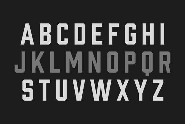
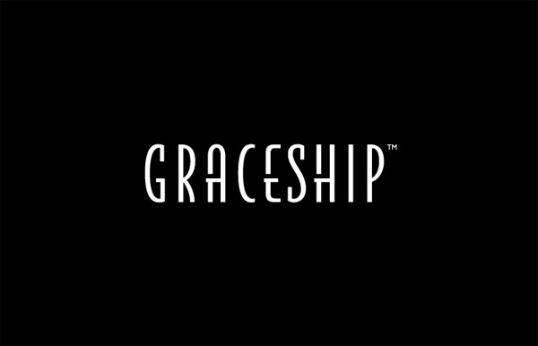
    Graceship Logo - Joe Prince Interview

    If, in some Freaky Friday-like situation, you could live the life of another designer, illustrator or creative, for a day, who would it be, and why?

    If it were Freaky Friday, I would first start off with a drink, because everybody loves Friday. Perhaps some billiards and superbike racing as well. Then I would contemplate for about half a second and think whose shoes I would want to fill for a day, and say Jonathan Hoefler. Although I have never personally met Jonathan and have only spoken with him a few times, he is someone who I admire tremendously as a typographer. His lettering work, along with Tobias’, is something that I find to be in another league than all the other typographers that currently exist. He always finds a way of creating typefaces that are like no other that have come before, and makes you realize that this is something you need even though it didn’t exist before. I guess I could compare his style to that of the great Steve Jobs and everything he did for Apple. Apple has a way of inventing products that are new, fresh, and appealing, and that is something reminiscent of Jonathan’s typefaces.

    How would you define success? Do you think you’ve found it yet?

    Success, in my opinion, is not a measure of one’s financial situation, but rather is a measure of one’s contentment and fulfilment in the things they have accomplished in their life. As Albert Einstein said, “try not to become a man of success, but rather to become a man of value.” To me, that is the most important concept that anyone should follow. It’s a very simple principle, but one that should be considered of the uppermost paths to follow. I’m a relatively young person – 23 – and feel I am successful not because I am rich (believe me, ramen goes a long way) but because I have full satisfaction in everything I have set out to do thus far in my life. I am very close with my family, which is also something that defines success in my eyes. Family is always there for you, through the thick and the thin. Without my family and loving parents, it’s difficult to say where I would be right now in my life (if anywhere at all). I owe an extreme amount of gratitude towards them in being some of the best parents I could have ever imagined, and continuing to be supportive and loving, even after I’m “all grow’d up.”

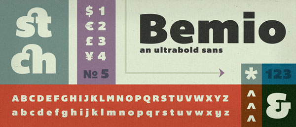
    Bemio - Joe Prince Interview

    And finally, what tips would you give to anybody who is looking to get started in design?

    Being a self-taught designer, my advice should always be taken with a grain of salt. That said, here is my advice (think salt). There are two routes a young designer can take, and without going into the details of those routes, one is good and one is, well, not good. The good route would be to continue learning the art and craft of design, whether it be through books or through raw experimentation and exploration. Don’t be afraid to fail – after all, failing to prepare is preparing to fail. Don’t worry if you don’t have clients: design as if you had clients. Create unique and memorable pieces of art that set you apart from other designers – just be you. One of my favorite sayings goes like this: If you choose a job you like, you never have to work a day in your life.

    Thanks Joe!

    Thanks a million to Joe for talking to me – I really enjoyed talking with him, and hopefully you love his answers as much as I do!

    Why not check out Joe’s site, and follow him on Dribbble and Twitter?

    Related Posts:

  5. One Minute With… Juri Zaech

    Leave a Comment

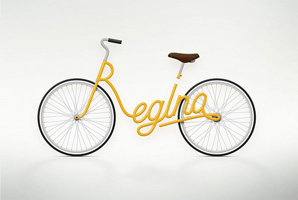
    Write a Bike, Regina - Juri Zaech Interview

    Hi Juri, thanks for taking the time to chat with One Minute With. Tell us a little bit about yourself and your work.

    Hi Conor, thanks for inviting me here. I grew up in the Swiss countryside and work now as an art director in an advertising agency in Paris. I moved here nearly 5 years ago and live with my girlfriend and a cat in a small but nice apartment close to the heart of the city, and a five minute bike ride to my workplace. On the side, I do personal projects: based on my background, they mainly focus on typography and type design. I guess it is especially that kind of work that made you approach me for this interview. In recent years, these projects have become quite important to me – It balances out my work, connects me with people and I get recognition through it. It is very rewarding.

    How did you get into design? Was there a defining point in your career, and if so, how did it shape you as a designer?

    It's actually been a long process to get where I am now. And it for sure will keep developing. When I started out I didn't have a set plan where I wanted to end up, things just went their way. I decided to do an apprenticeship in typography and lithography instead of going to the university. My mom was a ceramist and my dad an artist. So there were some leads to choose something artsy, but I still wanted it to be a craft or trade. It was a pragmatic decision without realizing all the ways this could open up.

    I lived in a small world back then and it seemed like I had reached a lifetime position when I got hired at a tiny local ad agency right after the apprenticeship. Seven years later came what you could call a defining point, I guess. I felt that my job wouldn't let me develop myself further. The conceptual part of creative advertising I discovered was one of the most thrilling tasks, but the opportunities were very limited. Because I didn't feel confident enough to just knock on a proper ad agency's door, I decided to leave Switzerland and attend a two year art direction portfolio program at Miami Ad School in Hamburg. Suddenly, I was among a group of people from all around the world striving to become great creatives. It was quite competitive, but in a good spirit. The school's system focuses mainly on practical tasks, so we experimented a lot and learned from each other. For me that was an incredibly interesting time because of all the new influence and the freedom of doing student work without boundaries again. It also gave me the confidence that I am able to realize projects on my own and don't need to be backed up by a company.

    Part of that program were internships in agencies around the world. So we got to travel and work in China and the USA. Finally I ended up in Paris with my two team partners, one from Sweden and one from the USA. We form a team of three, which is unusual in advertising, but it works out great and our different cultural backgrounds contribute to the team.

    Juri Zaech Interview

    If you could change one thing about your career to date, what would it be?

    Looking back, I could have gone abroad earlier, but in the end, it doesn't really matter. I prefer to think that things just take their course.

    When you released Frontage, you allowed users to download one of the weights for free with a tweet. Was that purely a marketing move, or did you also want to contribute to the community in some way? And with regards to the marketing side of it, how beneficial have you found such initiatives?

    I knew about the "Pay with a Tweet" system through my advertising experience. It was developed by Innovative Thunder, an incredible creative team that went to the same ad school. In the process of making Frontage I felt that I could give it a try in releasing one weight for free through that service. People love free fonts and it seemed a great tool to increase visibility. So yes, it was a marketing decision — and a bit of an experiment. The result was remarkable! It's definitely something I’d consider for future projects. In the end, it's all about the amount of people who see your work. The bigger the exposure, the more you'll sell. "Pay with a Tweet" has the advantage that you reward people for doing you a favor. I like that.

    Frontage - Juri Zaech Interview

    So, you work in advertising, but have also made a few lovely fonts: How different are the two sides of your work? What challenges do each pose, and what skills can you directly transfer from one into the other?

    The way I practice both of them is very different. Advertising is a full time job, it pays the bills and gives me 5 weeks of paid vacation a year. The work is creative but also very structured. Briefs, strategies and design guidelines are often set so that we only have a small space in which we have to develop our creative solution. That's challenging and very interesting at the same time, and the subjects are ever-changing.

    On the other hand, experimental typography is something I practically never get to do. Having a background in typography, I started to miss that and started to do creations on the side. They are more like a serious hobby by now. And other than in my job, I am my own boss – There are no clients, creative directors or accounts. I work at my own pace and don't follow deadlines. I am entirely responsible for every aspect of a project. That is a great freedom but I'm glad I can bounce off stuff of my girlfriend – who is an art director too – to get a second opinion once in a while.

    From a technical point of view, both sides are quite similar, the type stuff lets me be more experimental with executions but the real benefit is more on an inspirational level, and that works both ways.

    Where do you see yourself – and your career – in, say, 5 years?

    My girlfriend and I have a big book that explains in detail all the aspects of a self-sufficient lifestyle. It goes from building a house to setting up water wheels and of course everything about agriculture. It's really fascinating. This is probably not where I will be in five years, but it's a good thought to keep in the back of my head.

    For now, I am in Paris and enjoying it. In the future I can imagine to reduce the advertising work in favor of my side projects. Taking on more freelance could be an option, something I hesitantly do at the moment because I just don't have enough time for it. All this is very hypothetical. It will be something that my girlfriend and me will figure out together, and of course my team partners in the agency.

    Letter Love - Juri Zaech Interview

    If, in some Freaky Friday-like situation, you could live the life of another designer, illustrator or creative, for a day, who would it be, and why?

    That guy who painted the walls of the Lascaux Caves in southern France 17,000 years ago. Time travel, yes please!

    How would you define success? Do you think you've found it yet?

    There are little moments of success here and there, and they are important to stay motivated. And when a project is well-received it is especially rewarding. In our profession you start from scratch with every new project, and while one success fades you're already working on the next project. That keeps me going and I don't tend to reflect on my career. For me, it is more important to know that I am satisfied, and that has also a lot to do with my life outside of design or advertising work.

    Telemark - Juri Zaech Interview

    And finally, what tips would you give to anybody who is looking to get started in design?

    From my own experience (because I didn't do it enough) I would say it is important to move around quite a bit in the beginning. Trying out different areas in design to get a clearer picture of what your "dream position" is. For example, working in a very small or a big company are two different experiences, both are valuable. And that "dream position" will probably evolve with you as you grow.

    Thanks Juri!

    Thanks so much to Juri for giving us an insight into his world! I really enjoyed talking to him, and found his answers really interesting!

    Check out Juri’s site, and follow him on Dribbble!

    Related Posts:

  6. One Minute With… Mark Simonson

    Leave a Comment

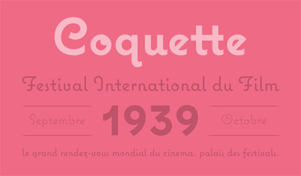
    Coquette - Mark Simonson Interview

    Hi Mark, thanks for taking the time to chat with One Minute With. Tell us a little bit about yourself and your work.

    I started out my professional life thinking I would be an illustrator, but quickly took a detour into art direction and graphic design, mostly working for magazines and later doing some packaging, product, and web design. All during this time, I was also doing lettering on a lot of my projects and had dreams of designing typefaces. Mostly it was just on paper, although I did submit a design to ITC in 1978 (rejected). When the Mac was introduced in 1984, I got one, and pretty soon after that started dabbling with making digital fonts on it. I released a few in the early nineties, but things didn’t really take off until I started selling fonts on the web in the early 2000s. Since about 2005, I’ve been working full time as an independent font developer, working out of my home in Saint Paul, Minnesota.

    How did you get into design? Was there a defining point in your career, and if so, how did it shape you as a designer?

    I was one of those kids who was “good at art” in school. I was drawing all the time. For a while, I wanted to be a cartoonist or animator. My first attempts to do graphic design were when I was in eighth grade, designing the cover of the school yearbook, stuff like that. I had an uncle who was a graphic designer so I knew that it was a thing you could do and it looked like something I wanted to do, too. By the time I finished high school, I had decided I wanted to be a commercial artist and studied art and design in college.

    Mark Simonson Interview

    If you could change one thing about your career to date, what would it be?

    I got interested in the idea of doing type design in college, but it was always kind of a pipe dream while I was working my day job as a graphic designer or art director. I didn’t get really serious about it until I was in my forties. I wasn’t sure I really wanted to get serious about it. I worried that it might get too boring, fiddling with tiny details of letters for months on end just to make one font. Maybe it’s just because I’m older now, but it seems to suit my temperament after all. I think it’s the combination of drawing and problem solving. I also enjoy the constraint of drawing letters. You’re never staring at a blank sheet and wondering what to draw – it’s always going to be a letter. I’ve had more success with it than anything else I’ve done, so I wish I’d gotten more serious about it sooner.

    Recently, there seems to have been quite a bit of comment online of the ubiquity of Proxima Nova – Have you noticed this, and if so, how do you feel about it? Is there ever a fear that a typeface you make might one day go the way of, say, Comic Sans or Papyrus?

    Yes, it’s gotten to be very popular. I couldn’t be happier about that. I released the original version of it back in 1995, but it didn’t really catch on. Better marketing probably would have helped, or maybe the market wasn’t ready for it. A similar typeface, Gotham, was released in the early 2000s and was a huge hit. Proxima Nova has benefited by being part of the same genre – the geometric neo-grotesque. I don’t think it will have the same fate as Comic Sans or Papyrus. Both of those typefaces are very mannered. Designers tend to quickly get tired of typefaces like that. Proxima Nova, by contrast, is very plain. Plain typefaces tend to stick around longer once they become established. I’m kind of counting on that, but who knows?

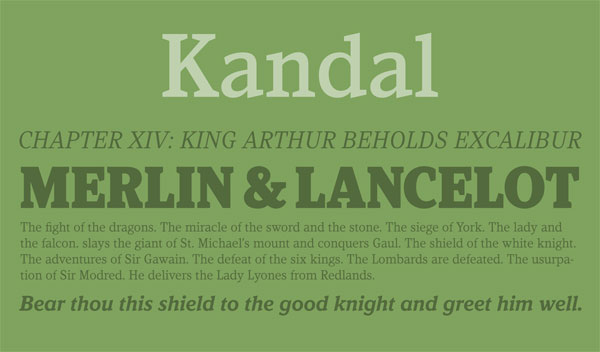
    Kandal - Mark Simonson Interview

    Outside of perhaps a blackletter font, you’ve pretty much, at one point in your career, released every kind of typeface – Scripts, serifs, sans-serifs – You name it. Is there one font category that you find more satisfying to work in, and why? And on the flip side (or maybe it’ll be the same answer) which category is the most frustrating to design for?

    I have a fairly broad taste in typefaces. But there are definitely some styles I’m not interested in. I’m not really into anything that looks like or tries to imitate calligraphy. I like pretty much everything else. When I’m thinking of new typefaces, I try to find the gaps in between existing genres. Coming up with designs like that is the most satisfying for me. That’s where Proxima Sans/Proxima Nova came from, and also Coquette. I’ve done a fair number of revivals, but I’ve decided I’d rather spend my time on original designs from now on as those have tended to be most successful for me and most satisfying.

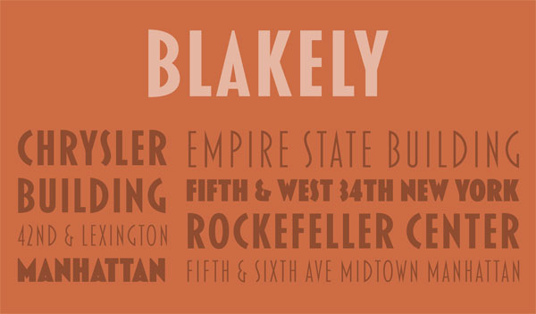
    Blakely - Mark Simonson Interview

    On a related note: Your work spans a variety of styles, and so, to me, it doesn’t seem as if you haven’t got as much of a unique style as others – whilst some type designers bring their voice to a typeface, I feel like you let a typeface speak with its own voice. Is this a conscious decision, or simply how your work has evolved? Do you see any positives or negatives to not necessarily having a distinct style?

    There may be a distinct style in there somewhere. I’d probably be the last person to be able to see it, though. Another thing I like to do is take on a particular genre, like say a 1940s script style, and get inside the head of a lettering artist from that time, kind of like an actor doing different characters with particular attitudes and behaviors and speech mannerisms, and come up with a design that might have existed as a font in that genre but doesn’t. I have to think that my typographic taste will still come through, even when I’m doing that.

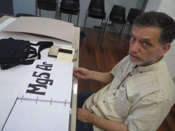
    Font Sketch - Mark Simonson Interview

    If, in some Freaky Friday-like situation, you could live the life of another designer, illustrator or creative, for a day, who would it be, and why?

    I’m not sure how to answer that. If I was somebody else, I wouldn’t know it, and if I did know it, then I wouldn’t be them, sort of like in Being John Malkovich or something. Maybe I’m taking the question too literally, or maybe I’ve read too much Philip K. Dick. It’s hard to choose one person in particular over all others. There are many people I admire and try to emulate and learn from. Some of my favorite books are biographies of creative people. I’m always trying to be the person I want to be, to improve myself as an artist and designer, so I love learning about other creative people and how they work and think.
    How would you define success? Do you think you’ve found it yet?

    I do feel like I’ve been successful. I think success is when you can make a living doing something you love. I felt successful as a graphic designer earlier in my life, but increasingly I felt like what I was doing was less and less relevant, like an old ball player or something, ready to retire. I was getting bored with it, putting my creative energies instead into model railroading, of all things. I realized later that I was in a creative rut. Then this font thing took off and now all that model railroading stuff is gathering dust in the basement. I can’t think of anything I’d rather be doing than making fonts. I feel really lucky in that I’ve been able to do it by selling to the general market rather than from commissioned work, which is more typically the case in this field. I’ve never felt more like an artist. I make what I want to make, and then, if I’m lucky, people buy it. So far, it’s been working for me.

    Workspace - Mark Simonson Interview

    And finally, what tips would you give to anybody who is looking to get started in design?

    When I started out almost 40 years ago, it was all done with pens and ink and knives and glue and cameras and T-squares. Now everything’s digital which makes a lot of things easier, but some things harder, like having to constantly keep up with new technologies. But forget about the tools. You can always learn new tools. The key is to learn the fundamentals, the basic principles of design. That stays current, no matter how much the tools change, and that’s the most valuable thing to know.

    Thanks Mark!

    Thanks a million to Mark for sharing his thoughts! I really enjoyed talking to him, and found his answers really interesting!

    Check out Mark’s site, and follow him on Flickr and Twitter?

    Related Posts:

  7. One Minute With… Mattox Shuler

    Leave a Comment

    Gin - Mattox Shuler Interview

    Hi Mattox, thanks for taking the time to chat with One Minute With. Tell us a little bit about yourself and your work.

    Thanks so much for the interview. I just turned 25 and have been working in Seattle, WA for the past few years, but grew up in the dirty South (Georgia). I currently daylight as a Copy Writer / Content Manager at Mars Hill Church and moonlight as an aspiring type designer under the guise of Hold Fast Foundry.

    How did you get into design? Was there a defining point in your career, and if so, how did it shape you as a designer?

    It’s not too romantic. Growing up, I was always doodling in class on notes. When I got into high school, I took an art class and snagged a copy of some Adobe apps because I wanted to make t-shirts and design a website for my band (like everyone else and their mom). That familiarized me with the tools and provided some fun, but I didn’t know jack squat about design or what to look for.

    After that, I headed off to the University of Georgia to study marketing and religion, but not much of design at all. I still doodled on class notes, did the casual t-shirt, and made a CD cover here and there, but nothing too fancy. Design was always a passion in the background, but I wasn’t sure if it could pay the bills.

    Upon graduating in 2010, I drove across the country to Seattle to study more and intern at Mars Hill whose designers (Patrick Mahoney and Matt Naylor) I respected a ton. I didn’t go there to get into design, but it just kind of happened as I tried to “help out” from time to time. Having those guys critique my work and walk me through designs has been the best thing. I still ask for their help on a weekly basis.

    I was also having to crank out an insane amount of graphic headers for all the daily web articles we put out. This helped discipline me with design and forced me to think about and research what typeface to use and how it interacted with the design. Thus began my love affair with fonts.

    Finally about a year ago, I decided to pick up a copy of Glyphs (I started with the mini version and later went to the full) to tackle my first typeface just for fun. And… it sucked. But it was a start though, and I’ve loved making typefaces ever since.

    Mattox Shuler Interview

    If you could change one thing about your career to date, what would it be?

    Man, that’s a hard one. As I’ve been diving more and more into type design, I see more and more how little I know. I’ve been able to read some books and connect with new friends in the world of type who’ve been super helpful in critiquing my work and bringing it to a better place. I think it’d be great though to have more programs around the country or world that have a hardcore focus on font creation. There are a couple, but it’d be awesome to see more.

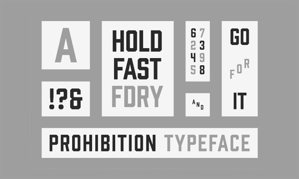
    So, your fonts Gin, Bourbon, Prohibition, and Abolition are all pretty similar, whilst retaining their own individual flairs. Have you attempted to build your typographic signature, or simply let it evolve on its own? In a field such as type design, how important do you thinking having a style is?

    I haven’t really attempted to build my own typographic signature. It’s something that just seems to be happening. What I look at evolves my tastes in type which shapes future releases. I recently bought a stack of books filled with 1920-40’s travel, war, labor, and WPA posters. The copy and the type in them are ridiculous (in the best way… and sometimes the worst). Those posters and that time period are completely fueling and inspiring my style right now.

    When people see the typefaces I make, they get to know me a little more. They see what letterforms and style I love. That has the potential to build trust and a relationship in some way. From that, anticipation for future releases and what’s to come is hopefully formed. So in a roundabout way, yes I think having a style is important… but challenging yourself and venturing outside of what you know can also be incredibly fruitful. You don’t want to be just a one-trick pony.

    Prohition Specimen - Mattox Shuler Interview

    Before you started selling your fonts, you released a few for free on Dribbble. There are some pretty obvious benefits to selling fonts commercially (i.e. the revenue) but have you found that the switch to commercial fonts brought about any new challenges?
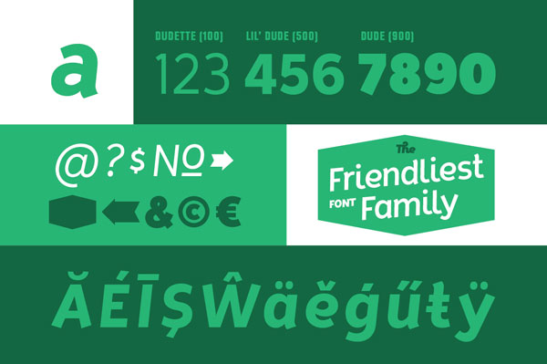
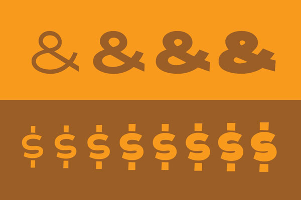
    There’s definitely a whole slew of challenges that come with commercial fonts, and all of them aren’t necessarily a bad thing. For instance and to be honest, with the free fonts I didn’t care too much about accented characters so oftentimes I just didn’t do them. This seems to be the case with a number of the free fonts that I’ve come across.
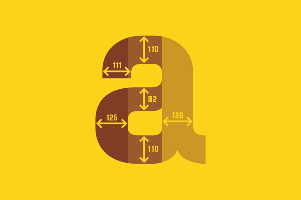
    With commercial fonts, I’m not making something that only serves me well. I want my typefaces to serve people across the world who speak different languages. It’s a challenge to learn, study, and start designing accented characters that I’ve never used in my life.

    Another challenge with commercial fonts is… you know, selling them. Unless you’ve created a typeface that constantly chills on top of the best seller lists (I’m looking at you Promixa Nova and Brandon Grotesque), then you’ve got some work ahead of you.

    Laura Worthington has really helped me think through how to get the word out on and time new releases. This windows of opportunity is incredibly important as not only can new releases generate sales, but they can help introduce people to your other fonts that might be a little harder to find. Ultimately though, you could make a typeface you love, but it’s just not the right time so it doesn’t sell well… which is okay.

    All that said, I do hope to offer a high-quality free typeface down the road as a thank you to the type / design community.

    Where do you see yourself in, say, 5 or 10 years?

    The world of type is continually changing at a drastic pace with app fonts, webfonts, and new designers making more typefaces every month. The game is evolving. I hope to adapt with it, but either way I love making fonts so I will keep doing that if it’s by making a living or just a fun thing on the side.

    A focus on display faces has consumed my time for now, but I hope to have a few text families by then (although those are a bit more arduous and time consuming). We’ll also see if I’m still camping out in the 20’s–40’s era (which is definitely possible as it’s filled with diverse type) or if a new time period is inspiring my taste.

    Lastly, though I love Seattle and the friends I’ve made out here, my wife and I will most likely be back somewhere in the South to be a little closer to family as we start one of our own.

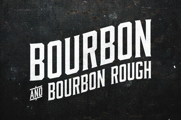
    Bourbon - Mattox Shuler Interview

    If, in some Freaky Friday-like situation, you could live the life of another designer, illustrator or creative, for a day, who would it be, and why?

    Although it would be super weird to be a girl, I think Jessica Hische has some killer stuff going on. She’s pretty much queen of the interwebs. She writes amazing articles, juggles a ton of different type / web projects, keeps ’em high quality, and gets to work alongside some fun clients. Yep, she’s legit.

    How would you define success? Do you think you’ve found it yet?

    Great question. One of the goals I set when starting out was to get on MyFonts Rising Stars newsletter. The response to Gin’s release was incredible and humbling to see as the typeface recently made an appearance there. That might sound like “success,” but I don’t think it is.

    God is the greatest creator. I’m created in his image for him, so I get to create. Success to me is working hard and joyfully serving God in what he has laid before me. I’m not here to build my kingdom come, it’s his. I often forget that and can fall into the snare of thinking that it’s all about me and my work. I can then let sales or goals dictate “success” or my view of myself, which results in pride when it’s going well or despair when it’s going bad.

    These things (sales, goals, having people know about your foundry, etc.) are not bad things, they’re actually good. But when they become the ultimate thing defining success in my life, they’re horrible. They turn everything into a cut-throat competition with everyone else because it’s all about me.

    These things are a fruit of success, but they are not success.

    So yes, like a glimmer, I think see success in my life at times when I joyfully do what I love for God. Other times, I miss it and make life or work about me. It’s a constant struggle and will be for the rest of my life. The good news is even though I may stray, I get to keep fighting through that and returning to God who forgives.

    Prohibition - Mattox Shuler Interview

    And finally, what tips would you give to anybody who is looking to get started in design?

    Start with fun personal projects. Help some friends or family. Try to study with, intern for, and or work alongside someone you look up. Be humble. Know your work or critiques of your work, for that matter, don’t define you. Keep a pulse on what today’s designers are working on (Dribbble is a great way to do that). Work hard. Make a lot of crap that you think is good, then make some stuff that is good. Keep helping out friends and family. Most of all, just have some fun.

    Thanks Mattox!

    I’m really grateful to Mattox for spending a few minutes with One Minute With. Hopefully you found his responses as interesting as I did!

    Why not check out Mattox’s site, and follow him on Dribbble and Twitter?

    Related Posts:

  8. One Minute With… Kyle Wayne Benson

    1 Comment

    Unvarnished Truth - Kyle Wayne Benson Interview

    Hi Kyle, thanks for taking the time to chat with One Minute With. Tell us a little bit about yourself and your work.

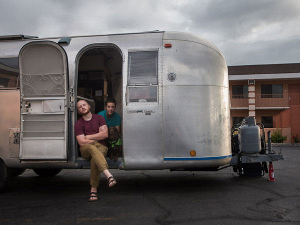
    No problem, Conor. I’m a Utah native, currently on a tour of the US of A with my wife and dog in a partially-restored ’66 Airstream. For the next few months we’re in Portland where I’m interning with Thomas Jockin so that I can learn more about type design.

    How did you get into design? Was there a defining point in your career, and if so, how did it shape you as a designer?

    Flash animation, when I was a teen. It was the gateway drug. And, honestly, what I do now doesn’t feel all that different. Except maybe that Adobe Illustrator crashes a lot more than Macromedia Flash ever did; and I know a few more curse words than I did then.

    It seems like a career is constantly being defined (you can ask my parents, they ask for the definition of mine all the time). But, most recently, I became stressed out by my rate and font pricing. I’m happy to report that it’s no longer a worry of mine. I came to the conclusion that doing quality work for quality clients made me just as happy as doing quality work for high-paying clients. Sure, I’ve gotta buy food and all, but after my bottom line is taken care of, the rest is just nonsense that runs the risk of getting your ideals all mixed up.

    Kyle Wayne Benson Interview

    Photo by Trevor Christensen

    If you could change one thing about your career to date, what would it be?

    I would have taken more time to be humble and learn from some of the artists around me. My pal Andrew Beck has been a great example of always looking for new ways to approach a project. He hasn’t lost that feeling of wonderment and that desire to learn. It really shows in his work.

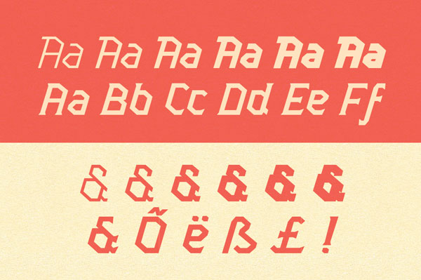
    Several of your commercial typefaces have initially grown from client work, whilst others you simply created of your own volition – How do the two processes differ? What new challenges do each bring?

    Honestly, the process isn’t all that different. They both stem the desire to attain a certain style. If the tool needed to execute that style doesn’t exist, I’ll take the time to build it. Some projects are one-of-a-kind and end with just a hand-lettered logotype. But some I can’t put down until the entire alphabet is sketched out. It’s become a major problem for me.

    Every project brings a new challenge, but I’m naturally challenged by having good taste. In the last year I’ve made some twenty odd font families but only released a handful. My inclination is to put them up for sale and let the sales speak for themselves. That’s when I remember the prime directive: to make the world a more beautiful place. Some of my fonts don’t sell well, but I know that they’re good tools because I use them with clients very often. Truly good design doesn’t measure itself on the rubric that economic growth does.

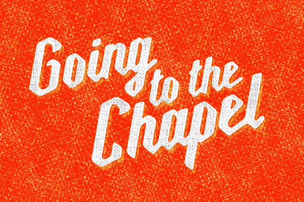
    Tide's In - Kyle Wayne Benson Interview

    In an industry where work can fluctuate so greatly, do you think it’s important for freelance designers to have a source of passive income (like your typefaces) or is it for you simply a hobby, more than an important income source?

    Passive income isn’t as passive as it sounds. It dominates more and more of my time and takes away from the problem-solving design that got me into all this in the first place. And kind of like I said before, It’s hard for me to find inspiration without steady client work.

    I think passive income is important, because I think it’s important to spend some time working for yourself. Being your own client is a valuable lesson that all designers should take the time to experience.

    Farmer's Co-Op - Kyle Wayne Benson Interview

    Where do you see yourself, and your career, in, say, 5 years?

    It’s hard to do anything but digital work when your space is limited to a truck and a 23′ trailer. I’d love to open up a shop where I can be a bit more expressive with my work. I’d also love to take all of my design friends and open a trade school that teaches graphic design, printmaking, and type drawing. I’d consider myself very fortunate to see that come about in just five years, so let’s call that the life goal.

    Clayton - Kyle Wayne Benson Interview

    If, in some Freaky Friday-like situation, you could live the life of another designer, illustrator or creative, for a day, who would it be, and why?

    Sheesh. This changes so often. If you’d asked a week ago, I would have said Doyald Young, but lately it has been Dan Christofferson. I went to one of his shows recently, and I can’t stop thinking about his work. He has truly mastered the fine line between illustration and graphic art. I wish I could be as illustratively expressive as he is. Not to mention, his work puts the meaning and message first and doesn’t sacrifice aesthetics along the way. Oh, and he’s just about the nicest guy in the Salt Lake Valley.

    How would you define success? Do you think you’ve found it yet?

    I really do believe that success is being able to decide where, when, and how you attain your livelihood. When you have attained that level of control, you have become a success. Half the reason my wife and I chose to live in the Airstream was to gain more control over our lives. I’ve spent too much of my life counting on others to let me know when I was or wasn’t successful. It wasn’t until I started doing what I loved and forgetting about the potential risks that I found the feeling of success I had longed for.

    Millie - Kyle Wayne Benson Interview

    And finally, what tips would you give to anybody who is looking to get started in design?

    Put everything else aside, and start studying bezier curves. Ten years in and I’m still mystified by their magic.

    Thanks Kyle!

    I’m really grateful to Kyle for spending a few minutes with One Minute With. Hopefully you found his responses as interesting as I did!
    Check out Kyle’s site, and follow him on Dribbble and Twitter!

    Related Posts:

  9. One Minute With… Gerren Lamson

    Leave a Comment

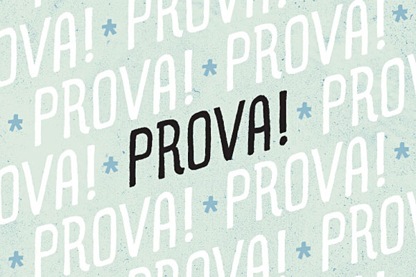
    Prova - Gerren Lamson Interview

    Hi Gerren, thanks for taking time to chat with One Minute With. Tell us a little bit about yourself and your work.

    Hi, Conor. Thanks for having me on One Minute With. I grew up in South Louisiana, and spent a lot of my youth investigating the world through creative activities. I enjoyed drawing (especially star wars, nature scenes, and the names of my friends), creating board games, cooking, playing piano, painting, and much more. I don’t think there were many times when I wasn’t exploring a creative project out of curiosity and the desire to express something visually or audibly — which is still pretty much the same way I operate today. I grew up with parents who encouraged my artistic and musical curiosities, so that was a huge influence on my development.

    I’ve been in the field of design for over 8 years now, and my journey during and after college led me through a variety of stops along the way, such as a technology consulting firm, a boutique graphic design firm, an interactive agency, a national advertising firm, among others. I’ve been fortunate to practice within different disciplines of design (i.e. identity, print, web, environmental, signage, etc.), which has resulted in strong integrated design thinking. I would encourage young designers to broaden the type of design projects they take on as it certainly shaped me into a designer with a larger skill set and broader perspective.

    Currently, I’ve been leading the design build as Chief Creative Officer for Creative Market over the last year. Creative Market is an online marketplace where independent creators buy and sell digital design content. For the longest time I’ve wanted to build something meaningful and sustainable for my peers, and Creative Market has afforded me that opportunity.

    It has been really interesting working on a platform that intersects digital commerce, creative user-generated content, and the larger design community. In terms of design, Creative Market has been a challenging but rewarding interactive platform to build with lots of unique problems to solve. For instance, releasing new social activity features (such as the ‘Like’, ‘Recommended’, ‘Following’, and ‘Collections’) impacts how users access the marketplace through our Adobe Extension and future apps. Or, integrating our custom recommendation engine requires larger user experience design considerations such as how it impacts user contexts in signed-out or logged-in states, recommending products in different parts of the experience, and influences all email notifications. I’ve learned a lot from designing and releasing various features into the initial foundation that we built, which launched in October of 2012. Also, I work with a great team, which is equally important when tackling a platform of this magnitude.

    To summarize my work, I can only describe it as a collection of points on a linear journey — each capitalizing off the education from the previous. I make an effort on every project to start with the user context, intended experience and most importantly, the ‘why’ question. Most of my client work utilizes the design vocabulary of the brand or identity I’m working on; however, I’ve increasingly enjoyed making visuals by hand over the last few years and have found ways to work that in — especially on my personal projects. I’ve worked for national brands and small local clients. I regularly create side projects that I find afford me the freedom to fail, play and experiment without any attachment to business. I think that’s been the most important choice I’ve made over the years: doing some work on the side for yourself just for the love of the craft. (See also: diversity is the spice of design.)

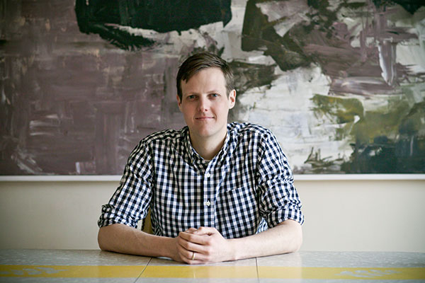
    Gerren Lamson Interview

    Walk us through a typical day in the life of Gerren Lamson.

    My day usually starts with a strong cup of coffee (or two), and a few quiet moments before I get going. Since I work remotely, I fire up HipChat to start conversation with my coworkers about the latest tasks we’re working on. Depending on the week, I split my time between working on comps of a new design feature, providing feedback on Asana and/or Skype, and shaping scope of upcoming projects (among a dozen other things). I also try to make time each week to read up on what’s happening in the design, tech and start-up industries online, and to see what my peers have been working on.

    Honestly, it’s hard to say what will happen in a typical day as working for a start-up puts me all over the map. Some weeks produce ‘fires’ that need to be put out, and others provide unforeseen opportunities to partner with related brands to promote Creative Market. It’s a bit of a roller-coaster ride. Oh, and everyone on the team (there are currently 11 of us) wears multiple hats. I think my favorite is the oversized sombrero of strategy.

    Also, I’m fortunate to work from home alongside my wife Morgana — a freelance designer and illustrator. It’s really nice and convenient to be able to share lunch or go on a walk at a moment’s notice. My typical weekend day may include a bit of illustration or screen printing for our joint project — Satchel & Sage. And every once in a while, I’m making something to sell on my Creative Market shop.

    How did you get into design?

    My love for drawing and artistic projects as a kid were probably what ultimately led me into design. Looking back, I can see how I was learning what design was in it’s basic forms through creative play. When I applied for college, I stumbled into choosing design as my degree because all the other visual art degrees scared the crap out of me when I thought about trying to make a living. I didn’t know what design was, but I knew that I didn’t want to be a ‘starving artist’ (the internet of today wasn’t around then to make it easier to make a living off a fine art career). Design sounded like the intersection of business and art to my 21 year old self, so I went for it.

    However, I didn’t focus on my studies very well. I was too busy writing mediocre electronic music, and it took me a long time to finish my bachelor’s degree. My collegiate design coursework had a heavy focus in logo design, typography, identity packages, and poster design. I only took 1 web course, which taught me how to design a web page using tables and iFrames. I took a lot of printmaking classes, and almost got a double-major because of it. I really enjoyed the laborious process of each printing style, and learned intaglio, screen printing, lithography, woodcut, among others. That strong interest in printmaking still informs a lot of my design work today. When I got out of school, my first job was at a tech consulting firm creating small business websites, so you can imagine the leap I had to take in terms of skill development from my traditional education. I truly just fell into web design, and I’ve been loving it ever since.

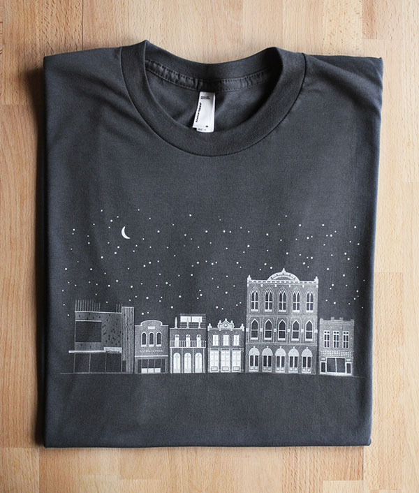
    SBX Shirt - Gerren Lamson Interview

    How do you approach a new project? What’s your creative process like?

    My creative process varies depending on the medium. For work projects, I prefer an approach where the process builds on initial planning, strategy, research and analytics, but then allows for moments of restrictive creative brainstorming. Those restrictions, I find, produce smarter design concepts that keep the big picture in perspective. And by big picture, I’m referring to the contextual user experience as it aligns with the business goals of the brand. That can be lost pretty quickly when you dive into visual details, where one of the addictive parts of design occurs.

    For my play projects, it’s a messy free-for-all. As Austin Kleon describes in this video, I may be one of the ‘chain smoking’ creative types when it comes to always having another personal project in the queue as I’m finishing the last one. With these, the process is the product, which may be an indication that documenting (time-lapse?) the approach used in each unique project is beneficial to share alongside the final result.

    For web design, I think there has been continual discussion about moving away from a linear approach (e.g. waterfall model), and benefiting from using an iterative, multi-team approach for large web projects. I think that this post by Trent Walton sums up this new direction that we should be investing and writing about more, and putting into practice.

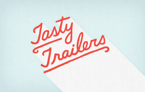
    Tasty Trailers - Gerren Lamson Interview

    You’ve created some awesome resources which you sell on your site, and also write the odd tutorial on Method & Craft. How important is it to get yourself involved in the design community, do you feel?

    I think it’s extremely important for designers to get involved by supporting and challenging the design community, because we’re all in this together. It’s equally important to find meaningful ways to give back to your peers (and in other industries too). I originally created my design resources as selfish tools to use in my own projects, but it wasn’t until later on that I found selling them helped me be more active in the community. And, eventually they created the opportunity for me to give back to my peers by working on Creative Market. With Method & Craft, I was fortunate to be around Phil when he was launching the site and he asked me to contribute. He’s a good dude. I see big things in store for M&C in the future, and everyone should try to participate with it.

    The older I get, the more I want to share my experiences to those who are coming up next in design. That will probably reveal itself as a bit more writing, speaking, tutorials, and resources. We’ll see!

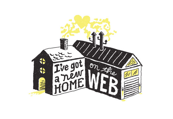
    I've got a new home on the web - Gerren Lamson Interview

    Your style is wonderfully handcrafted, with something of a vintage Midwestern slant. Where do you get inspiration?

    Interesting. I’ve never heard of vintage Midwestern so I just now went to look it up! I’ll be honest, I do my best to learn many styles, as I don’t think style is the first thing that a designer should have in mind. However, in my personal work, I keep coming back to wanting to make something with my hands (the default tool) as a way to temporarily relieve myself from using the computer as a primary design tool. It’s produced interesting results, so I’ve played into that over the last few years and pushed it a few different ways.

    I get inspired from traveling, spending time in nature, and digging through historic design trends. I’m fond of the French Art Deco movement (especially the typography), the illustrated posters of Henri de Toulouse-Lautrec, paintings of the Impressionist Period, the illustration style of Charley Harper, to name a few. Also, any piece of art made by hand with superb attention to detail imbued with concept always wins me over.

    If, in some Freaky Friday-like situation, you could live the life of another designer, illustrator or creative, for a day, who would it be, and why?

    If I had to swap, I would choose someone who isn’t a designer or illustrator, just for the sake of diversity. Someone like Galileo — who had a fascinating way of coming up with inventions to get at the root of how the world works. After I saw the museum dedicated to his work in Florence, I was blown away. If I had to pick a designer, I’d go for Herb Lubalin for his typographic creativity or Saul Bass for his conceptual sequences in film. If I had to pick an illustrator, I’d go for Charley Harper for his ability to interpret flora and fauna through geometric structure or Ralph McQuarrie for his brilliant visualizations of the Star Wars universe as the first film was being made. McQuarrie sounds like the most fun, so I’ll say that he is my final answer.

    The Bluegrass Situation - Gerren Lamson Interview

    What design tools could you not live without?

    As far as physical tools, I can’t be without my Wacom Intuos tablet. It’s changed the way I work over the last few years, and it’s so much more natural than a mouse. I also carry a Moleskine notebook and Micron 05 pens around with me most of the time. All other tools seem to shift with the times, with the exception of Illustrator, which I’m so fond of as I’ve learned many shortcuts and specific methods of production.

    I would also add that I don’t think I could work these days without my previous design experiences or my trusted group of peers, which are almost more important to me than the physical tools.

    And finally, what tips would you give to anybody who is looking to get started in design?

    Sure! Here are a few bits of advice that might benefit folks who are just starting out:

    1. Be nice to everyone. To the extent that I think it’s a pre-requisite for making good work, because what you make takes on your attitude and perspective. Since we’re all in this together, a little kindness goes a long way to building the sort of community that I think we all want to be a part of.

    2. Start personal projects that force you to experiment with new skills and design thinking. Make things people want and share the process (and final product). Let yourself ‘fail’ to some extent with these projects, as you’ll get the best education from the time invested in them.

    3. In digital, explore the contextual user experience (UX) before designing any user interface (UI) elements. It’s too easy to go down a black hole of endlessly tweaking interface visuals until they look beautiful, but you can miss the purpose and intention of your digital product in doing so.

    4. Start (and keep up) a blog that tracks the evolution of your design thinking and demarcates when you finish projects. Don’t stop posting to it. Over time you’ll see the journey that has shaped how you work and think, which is extremely valuable.

    5. The internet is full of resources for DIY education. Set a schedule for yourself to learn a new skill or approach on a monthly basis, and stick to it.

    6. Don’t over focus on design. Go out and see the world, read often, and make friends that you can trust to support you. Design is not the only thing in life.

    Thanks Gerren!

    Thanks a million to Gerren for sharing his thoughts! I really enjoyed talking to him, and found his answers really interesting!

    Why not check out Gerren’s site, and follow him on Dribbble and Twitter?

    Related Posts: