One Minute With…
Joe Prince
Hi Joe, thanks for taking the time to chat with One Minute With. Tell us a little bit about yourself and your work.
Hello Conor – thanks very much for taking interest in my work. It’s always nice to hear others appreciate the art of the craft, whether it be for logos or typography.
Design is a universal thing that can be shared and interpreted by any race or age, which makes it beautiful – That’s one of the reasons why I have always been fascinated by design. From as far back as I can remember, I have always had a black-and-white personality; something that comes across in my designs. This mentality has led to a simplistic style that I developed over the years, in both logos and typography. One philosophy that is important to keep in mind when trying to achieve a simplistic and minimalistic style is that just because it’s simple doesn’t mean it’s good. Just as there is a difference between colorful designs that clash, and colorful designs that harmonize, there is a difference between simplicity and blandness, especially in typography.
How did you get into design? Was there a defining point in your career, and if so, how did it shape you as a designer?
How I got started is sort of an ironic story – one might say it’s funny. This is how it all got started: About 7 years ago, I got caught in some bad drugs while I was in high school. I was 16 at the time and started hanging out with the wrong crowd, going to parties every weekend and getting into mischief. The drug usage got really heavy and the caliber of drugs I started experimenting with was really bad. My black-and-white personality contributed nothing but trouble to this lifestyle, because once I started, it was hard to stop me.
Long story short, this went on for a few years and before I was 18, my parents sent me to rehab. I was there for a few months, was supposed to find a “higher power”, and was on my way – The last time I used drugs was December 24th, 2007, so my official clean day is Christmas Day of 2007. While I was in rehab, I needed something to do to occupy my time and take my mind off the drugs, so I started sketching designs (shirts, logos, etc.) just for fun. After I was back home from rehab, I continued sketching and have never looked back since.

If you could change one thing about your career to date, what would it be?
Well as a precursor to answering this question, I want to say that I am a full-time college student studying mechanical engineering. I have a little over a year to go to get my Bachelor’s degree, and then I will continue shortly after that for my Master’s. Design is something that I do as a side-job, and it fits perfectly with my constantly-changing school schedule because I can make my own hours. If I have to work late into the night or need to take a day off to study, it’s not a problem at all. Finding a balance between engineering and design is a battle that I have faced for the past few years, because I am passionate about each of them. Ultimately, I hope to combine my two loves into one career, where I can use my artistic and mathematical skills to do something that benefits mankind. To go back to the original question, I wouldn’t change one thing at all. I’m a firm believer that things happen for a reason. Even if, at the time, it doesn’t seem logical or fair, in the long run it all maps out nicely. I could be dead right now and not have design or engineering in my life. I’m one lucky person.
So, you’ve designed a bunch of typefaces specifically for use as part of Google Web Fonts – What’s that process like? What extra factors need to be taken into consideration when you’re building a font specifically for the web?
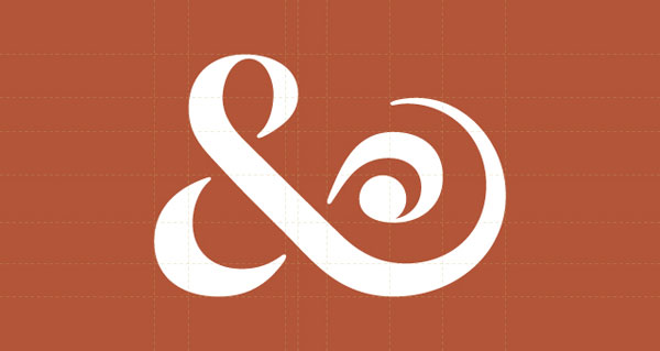
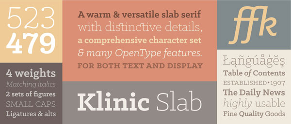
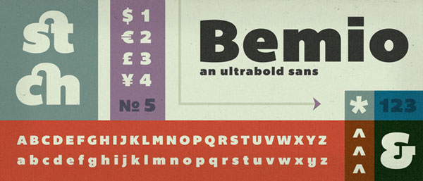
The Google Web Font project was something that I got involved with sort of inadvertently. Several years back, I designed a font called Maven for a company I was working for at the time. It was a small company consisting of myself and three other web designers and coders. We released Maven through the website as a means of attracting customers and getting more hits. This actually worked quite well, and we were getting a lot of good clients. Since this was the first font I ever created, however, there were several things fundamentally wrong with it. For starters, the bold and thin versions consisted of uniweight strokes and for some reason I neglected to clean up the dozens of random nodes. I thought that the font creation programs imported the characters from Illustrator and “magically” cleaned them up, so I figured I didn’t need to waste time doing that. About a year after Maven was released, I decided to revisit the typeface as I had learned a lot about typography during that time simply by studying other fonts and being observant anywhere I went. After all, I think it’s nearly impossible to go anywhere without seeing some form of lettering. So I undertake the process of redesigning Maven from the ground up, improving on things such as optical balance, letter pair cohesion, and spacing/kerning, amongst other improvements. After I was all finished with “Maven 2.0” I decided to publish it under the name Maven Pro. I filled out a proposal with some font specimens for Maven Pro and sent it off to Google, in hopes of working with them on webfonts. Long story short, I was contacted by one of the representatives who was overseeing the project and began designing new fonts.
One of the main differences between designing for web and designing for print is that hinting must be taken into consideration for webfonts. Even if a character looks perfect and is fundamentally sound, it may have to be adjusted for 12pt or less implementation as horizontal crossbars can shift a pixel and make the character look odd; serifs may grow (or shrink) based on the pixel fitting, etc. This is a crucial methodology for creating webfonts, because if it doesn’t end up rendering well on the web then it is as useful as a Ferrari with no steering wheel.
As more and more of your typefaces are released, I’m beginning to notice your signature throughout them – Despite them being unique, distinct typefaces, many of them feel decidedly “Joe Prince-y”. Is that intentional? Do you intend to weave a common voice throughout your work, or is it merely a nice side effect?
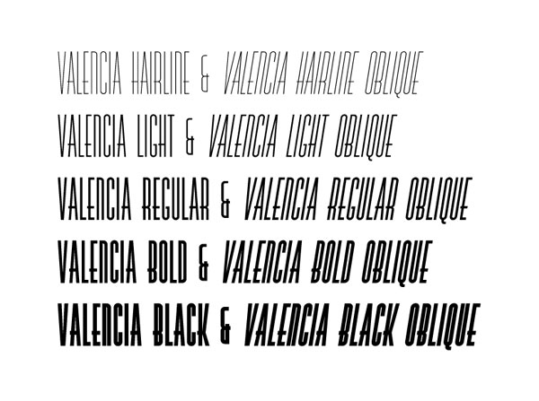
Developing a style – or a signature, if you will – is not something that a person decides to “just do”. It is something that develops over time as a way of utilizing similar techniques and processes that they have learned, and returning a final product that is representative of those traits. Depending on what style a person develops, I feel that it can be either really extraordinary or really repetitive and menial (in a bad way). I’ve never noticed that I have a developed style in my typography, but I hope it is a style that others find attractive and useful if it is indeed present. Perhaps it is my innate sense of geometrical forms and keen eye for symmetry that have transpired over the years through my engineering courses that lend to this style. All of my fonts and typefaces have a somewhat simplistic and geometric feel to them, which is something the Swiss have learned to do quite well (Helvetica especially – you beautiful bastard, Max). I am very fond of the Swiss style of design – a less-is-more philosophy. One day, I hope to transform into a Swiss typographer, kind of like a caterpillar turning into a moth (a moth that can move nodes around a blank canvas and make an appealing design.)
I guess, to grossly oversimplify the work you do, one could say that you work primarily with typefaces and branding (often combining the two.) But, if you could only do one of these, for the rest of your career, which would it be, and why?
Well, as I mentioned above, I will ultimately delve into the engineering world when the time comes. That doesn’t mean I will abandon design completely, it will always have a special place in my heart. Designing letters isn’t something I do because the money is good – any typographer knows that. I do it because I love everything about creating unique letterforms that communicate a certain message. After all, that is the underlying basis for any typographical piece or design; to speak to the audience and paint a picture in their mind of whatever the designer intended.
If I were to choose, though, I would overwhelmingly lean towards typography rather than branding. Branding is great, don’t get me wrong, but there is just something about designing an entire typeface that you know will be in the hands of thousands of people. Seeing how other designers interpret and implement a typeface into one of their own designs brings me great joy, and I can’t say that euphoric feeling comes to me in branding.
If, in some Freaky Friday-like situation, you could live the life of another designer, illustrator or creative, for a day, who would it be, and why?
If it were Freaky Friday, I would first start off with a drink, because everybody loves Friday. Perhaps some billiards and superbike racing as well. Then I would contemplate for about half a second and think whose shoes I would want to fill for a day, and say Jonathan Hoefler. Although I have never personally met Jonathan and have only spoken with him a few times, he is someone who I admire tremendously as a typographer. His lettering work, along with Tobias’, is something that I find to be in another league than all the other typographers that currently exist. He always finds a way of creating typefaces that are like no other that have come before, and makes you realize that this is something you need even though it didn’t exist before. I guess I could compare his style to that of the great Steve Jobs and everything he did for Apple. Apple has a way of inventing products that are new, fresh, and appealing, and that is something reminiscent of Jonathan’s typefaces.
How would you define success? Do you think you’ve found it yet?
Success, in my opinion, is not a measure of one’s financial situation, but rather is a measure of one’s contentment and fulfilment in the things they have accomplished in their life. As Albert Einstein said, “try not to become a man of success, but rather to become a man of value.” To me, that is the most important concept that anyone should follow. It’s a very simple principle, but one that should be considered of the uppermost paths to follow. I’m a relatively young person – 23 – and feel I am successful not because I am rich (believe me, ramen goes a long way) but because I have full satisfaction in everything I have set out to do thus far in my life. I am very close with my family, which is also something that defines success in my eyes. Family is always there for you, through the thick and the thin. Without my family and loving parents, it’s difficult to say where I would be right now in my life (if anywhere at all). I owe an extreme amount of gratitude towards them in being some of the best parents I could have ever imagined, and continuing to be supportive and loving, even after I’m “all grow’d up.”
And finally, what tips would you give to anybody who is looking to get started in design?
Being a self-taught designer, my advice should always be taken with a grain of salt. That said, here is my advice (think salt). There are two routes a young designer can take, and without going into the details of those routes, one is good and one is, well, not good. The good route would be to continue learning the art and craft of design, whether it be through books or through raw experimentation and exploration. Don’t be afraid to fail – after all, failing to prepare is preparing to fail. Don’t worry if you don’t have clients: design as if you had clients. Create unique and memorable pieces of art that set you apart from other designers – just be you. One of my favorite sayings goes like this: If you choose a job you like, you never have to work a day in your life.
Thanks Joe!
Thanks a million to Joe for talking to me – I really enjoyed talking with him, and hopefully you love his answers as much as I do!
Why not check out Joe’s site, and follow him on Dribbble and Twitter?