One Minute With…
Mark Simonson
Hi Mark, thanks for taking the time to chat with One Minute With. Tell us a little bit about yourself and your work.
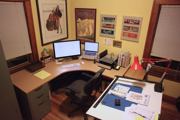
I started out my professional life thinking I would be an illustrator, but quickly took a detour into art direction and graphic design, mostly working for magazines and later doing some packaging, product, and web design. All during this time, I was also doing lettering on a lot of my projects and had dreams of designing typefaces. Mostly it was just on paper, although I did submit a design to ITC in 1978 (rejected). When the Mac was introduced in 1984, I got one, and pretty soon after that started dabbling with making digital fonts on it. I released a few in the early nineties, but things didn’t really take off until I started selling fonts on the web in the early 2000s. Since about 2005, I’ve been working full time as an independent font developer, working out of my home in Saint Paul, Minnesota.
How did you get into design? Was there a defining point in your career, and if so, how did it shape you as a designer?
I was one of those kids who was “good at art” in school. I was drawing all the time. For a while, I wanted to be a cartoonist or animator. My first attempts to do graphic design were when I was in eighth grade, designing the cover of the school yearbook, stuff like that. I had an uncle who was a graphic designer so I knew that it was a thing you could do and it looked like something I wanted to do, too. By the time I finished high school, I had decided I wanted to be a commercial artist and studied art and design in college.
If you could change one thing about your career to date, what would it be?
I got interested in the idea of doing type design in college, but it was always kind of a pipe dream while I was working my day job as a graphic designer or art director. I didn’t get really serious about it until I was in my forties. I wasn’t sure I really wanted to get serious about it. I worried that it might get too boring, fiddling with tiny details of letters for months on end just to make one font. Maybe it’s just because I’m older now, but it seems to suit my temperament after all. I think it’s the combination of drawing and problem solving. I also enjoy the constraint of drawing letters. You’re never staring at a blank sheet and wondering what to draw – it’s always going to be a letter. I’ve had more success with it than anything else I’ve done, so I wish I’d gotten more serious about it sooner.
Recently, there seems to have been quite a bit of comment online of the ubiquity of Proxima Nova – Have you noticed this, and if so, how do you feel about it? Is there ever a fear that a typeface you make might one day go the way of, say, Comic Sans or Papyrus?
Yes, it’s gotten to be very popular. I couldn’t be happier about that. I released the original version of it back in 1995, but it didn’t really catch on. Better marketing probably would have helped, or maybe the market wasn’t ready for it. A similar typeface, Gotham, was released in the early 2000s and was a huge hit. Proxima Nova has benefited by being part of the same genre – the geometric neo-grotesque. I don’t think it will have the same fate as Comic Sans or Papyrus. Both of those typefaces are very mannered. Designers tend to quickly get tired of typefaces like that. Proxima Nova, by contrast, is very plain. Plain typefaces tend to stick around longer once they become established. I’m kind of counting on that, but who knows?
Outside of perhaps a blackletter font, you’ve pretty much, at one point in your career, released every kind of typeface – Scripts, serifs, sans-serifs – You name it. Is there one font category that you find more satisfying to work in, and why? And on the flip side (or maybe it’ll be the same answer) which category is the most frustrating to design for?
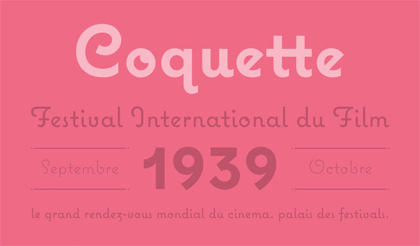
I have a fairly broad taste in typefaces. But there are definitely some styles I’m not interested in. I’m not really into anything that looks like or tries to imitate calligraphy. I like pretty much everything else. When I’m thinking of new typefaces, I try to find the gaps in between existing genres. Coming up with designs like that is the most satisfying for me. That’s where Proxima Sans/Proxima Nova came from, and also Coquette. I’ve done a fair number of revivals, but I’ve decided I’d rather spend my time on original designs from now on as those have tended to be most successful for me and most satisfying.
On a related note: Your work spans a variety of styles, and so, to me, it doesn’t seem as if you haven’t got as much of a unique style as others – whilst some type designers bring their voice to a typeface, I feel like you let a typeface speak with its own voice. Is this a conscious decision, or simply how your work has evolved? Do you see any positives or negatives to not necessarily having a distinct style?
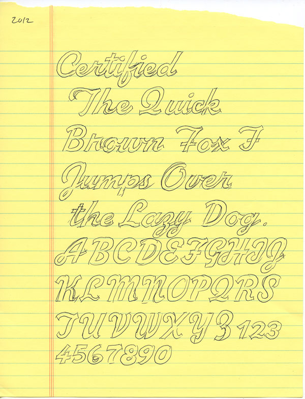
There may be a distinct style in there somewhere. I’d probably be the last person to be able to see it, though. Another thing I like to do is take on a particular genre, like say a 1940s script style, and get inside the head of a lettering artist from that time, kind of like an actor doing different characters with particular attitudes and behaviors and speech mannerisms, and come up with a design that might have existed as a font in that genre but doesn’t. I have to think that my typographic taste will still come through, even when I’m doing that.
If, in some Freaky Friday-like situation, you could live the life of another designer, illustrator or creative, for a day, who would it be, and why?
I’m not sure how to answer that. If I was somebody else, I wouldn’t know it, and if I did know it, then I wouldn’t be them, sort of like in Being John Malkovich or something. Maybe I’m taking the question too literally, or maybe I’ve read too much Philip K. Dick. It’s hard to choose one person in particular over all others. There are many people I admire and try to emulate and learn from. Some of my favorite books are biographies of creative people. I’m always trying to be the person I want to be, to improve myself as an artist and designer, so I love learning about other creative people and how they work and think.
How would you define success? Do you think you’ve found it yet?
I do feel like I’ve been successful. I think success is when you can make a living doing something you love. I felt successful as a graphic designer earlier in my life, but increasingly I felt like what I was doing was less and less relevant, like an old ball player or something, ready to retire. I was getting bored with it, putting my creative energies instead into model railroading, of all things. I realized later that I was in a creative rut. Then this font thing took off and now all that model railroading stuff is gathering dust in the basement. I can’t think of anything I’d rather be doing than making fonts. I feel really lucky in that I’ve been able to do it by selling to the general market rather than from commissioned work, which is more typically the case in this field. I’ve never felt more like an artist. I make what I want to make, and then, if I’m lucky, people buy it. So far, it’s been working for me.
And finally, what tips would you give to anybody who is looking to get started in design?
When I started out almost 40 years ago, it was all done with pens and ink and knives and glue and cameras and T-squares. Now everything’s digital which makes a lot of things easier, but some things harder, like having to constantly keep up with new technologies. But forget about the tools. You can always learn new tools. The key is to learn the fundamentals, the basic principles of design. That stays current, no matter how much the tools change, and that’s the most valuable thing to know.