One Minute With…
Kyle Wayne Benson
Hi Kyle, thanks for taking the time to chat with One Minute With. Tell us a little bit about yourself and your work.
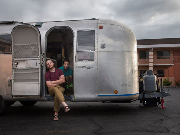
No problem, Conor. I’m a Utah native, currently on a tour of the US of A with my wife and dog in a partially-restored ’66 Airstream. For the next few months we’re in Portland where I’m interning with Thomas Jockin so that I can learn more about type design.
How did you get into design? Was there a defining point in your career, and if so, how did it shape you as a designer?
Flash animation, when I was a teen. It was the gateway drug. And, honestly, what I do now doesn’t feel all that different. Except maybe that Adobe Illustrator crashes a lot more than Macromedia Flash ever did; and I know a few more curse words than I did then.
It seems like a career is constantly being defined (you can ask my parents, they ask for the definition of mine all the time). But, most recently, I became stressed out by my rate and font pricing. I’m happy to report that it’s no longer a worry of mine. I came to the conclusion that doing quality work for quality clients made me just as happy as doing quality work for high-paying clients. Sure, I’ve gotta buy food and all, but after my bottom line is taken care of, the rest is just nonsense that runs the risk of getting your ideals all mixed up.
If you could change one thing about your career to date, what would it be?
I would have taken more time to be humble and learn from some of the artists around me. My pal Andrew Beck has been a great example of always looking for new ways to approach a project. He hasn’t lost that feeling of wonderment and that desire to learn. It really shows in his work.
Several of your commercial typefaces have initially grown from client work, whilst others you simply created of your own volition – How do the two processes differ? What new challenges do each bring?
Honestly, the process isn’t all that different. They both stem the desire to attain a certain style. If the tool needed to execute that style doesn’t exist, I’ll take the time to build it. Some projects are one-of-a-kind and end with just a hand-lettered logotype. But some I can’t put down until the entire alphabet is sketched out. It’s become a major problem for me.
Every project brings a new challenge, but I’m naturally challenged by having good taste. In the last year I’ve made some twenty odd font families but only released a handful. My inclination is to put them up for sale and let the sales speak for themselves. That’s when I remember the prime directive: to make the world a more beautiful place. Some of my fonts don’t sell well, but I know that they’re good tools because I use them with clients very often. Truly good design doesn’t measure itself on the rubric that economic growth does.
In an industry where work can fluctuate so greatly, do you think it’s important for freelance designers to have a source of passive income (like your typefaces) or is it for you simply a hobby, more than an important income source?
Passive income isn’t as passive as it sounds. It dominates more and more of my time and takes away from the problem-solving design that got me into all this in the first place. And kind of like I said before, It’s hard for me to find inspiration without steady client work.
I think passive income is important, because I think it’s important to spend some time working for yourself. Being your own client is a valuable lesson that all designers should take the time to experience.
Where do you see yourself, and your career, in, say, 5 years?
It’s hard to do anything but digital work when your space is limited to a truck and a 23′ trailer. I’d love to open up a shop where I can be a bit more expressive with my work. I’d also love to take all of my design friends and open a trade school that teaches graphic design, printmaking, and type drawing. I’d consider myself very fortunate to see that come about in just five years, so let’s call that the life goal.
If, in some Freaky Friday-like situation, you could live the life of another designer, illustrator or creative, for a day, who would it be, and why?
Sheesh. This changes so often. If you’d asked a week ago, I would have said Doyald Young, but lately it has been Dan Christofferson. I went to one of his shows recently, and I can’t stop thinking about his work. He has truly mastered the fine line between illustration and graphic art. I wish I could be as illustratively expressive as he is. Not to mention, his work puts the meaning and message first and doesn’t sacrifice aesthetics along the way. Oh, and he’s just about the nicest guy in the Salt Lake Valley.
How would you define success? Do you think you’ve found it yet?
I really do believe that success is being able to decide where, when, and how you attain your livelihood. When you have attained that level of control, you have become a success. Half the reason my wife and I chose to live in the Airstream was to gain more control over our lives. I’ve spent too much of my life counting on others to let me know when I was or wasn’t successful. It wasn’t until I started doing what I loved and forgetting about the potential risks that I found the feeling of success I had longed for.
And finally, what tips would you give to anybody who is looking to get started in design?
Put everything else aside, and start studying bezier curves. Ten years in and I’m still mystified by their magic.
1 Comment
Laurie
I like to use Kyle’s font “Farmer’s Co-Op” for posters in the classroom. The *extralight thickness is perfect for the clarity needed from student desk to classroom wall. Thanks, Kyle!