One Minute With…
Gerren Lamson
Hi Gerren, thanks for taking time to chat with One Minute With. Tell us a little bit about yourself and your work.
Hi, Conor. Thanks for having me on One Minute With. I grew up in South Louisiana, and spent a lot of my youth investigating the world through creative activities. I enjoyed drawing (especially star wars, nature scenes, and the names of my friends), creating board games, cooking, playing piano, painting, and much more. I don’t think there were many times when I wasn’t exploring a creative project out of curiosity and the desire to express something visually or audibly — which is still pretty much the same way I operate today. I grew up with parents who encouraged my artistic and musical curiosities, so that was a huge influence on my development.
I’ve been in the field of design for over 8 years now, and my journey during and after college led me through a variety of stops along the way, such as a technology consulting firm, a boutique graphic design firm, an interactive agency, a national advertising firm, among others. I’ve been fortunate to practice within different disciplines of design (i.e. identity, print, web, environmental, signage, etc.), which has resulted in strong integrated design thinking. I would encourage young designers to broaden the type of design projects they take on as it certainly shaped me into a designer with a larger skill set and broader perspective.
Currently, I’ve been leading the design build as Chief Creative Officer for Creative Market over the last year. Creative Market is an online marketplace where independent creators buy and sell digital design content. For the longest time I’ve wanted to build something meaningful and sustainable for my peers, and Creative Market has afforded me that opportunity.
It has been really interesting working on a platform that intersects digital commerce, creative user-generated content, and the larger design community. In terms of design, Creative Market has been a challenging but rewarding interactive platform to build with lots of unique problems to solve. For instance, releasing new social activity features (such as the ‘Like’, ‘Recommended’, ‘Following’, and ‘Collections’) impacts how users access the marketplace through our Adobe Extension and future apps. Or, integrating our custom recommendation engine requires larger user experience design considerations such as how it impacts user contexts in signed-out or logged-in states, recommending products in different parts of the experience, and influences all email notifications. I’ve learned a lot from designing and releasing various features into the initial foundation that we built, which launched in October of 2012. Also, I work with a great team, which is equally important when tackling a platform of this magnitude.
To summarize my work, I can only describe it as a collection of points on a linear journey — each capitalizing off the education from the previous. I make an effort on every project to start with the user context, intended experience and most importantly, the ‘why’ question. Most of my client work utilizes the design vocabulary of the brand or identity I’m working on; however, I’ve increasingly enjoyed making visuals by hand over the last few years and have found ways to work that in — especially on my personal projects. I’ve worked for national brands and small local clients. I regularly create side projects that I find afford me the freedom to fail, play and experiment without any attachment to business. I think that’s been the most important choice I’ve made over the years: doing some work on the side for yourself just for the love of the craft. (See also: diversity is the spice of design.)
Walk us through a typical day in the life of Gerren Lamson.
My day usually starts with a strong cup of coffee (or two), and a few quiet moments before I get going. Since I work remotely, I fire up HipChat to start conversation with my coworkers about the latest tasks we’re working on. Depending on the week, I split my time between working on comps of a new design feature, providing feedback on Asana and/or Skype, and shaping scope of upcoming projects (among a dozen other things). I also try to make time each week to read up on what’s happening in the design, tech and start-up industries online, and to see what my peers have been working on.
Honestly, it’s hard to say what will happen in a typical day as working for a start-up puts me all over the map. Some weeks produce ‘fires’ that need to be put out, and others provide unforeseen opportunities to partner with related brands to promote Creative Market. It’s a bit of a roller-coaster ride. Oh, and everyone on the team (there are currently 11 of us) wears multiple hats. I think my favorite is the oversized sombrero of strategy.
Also, I’m fortunate to work from home alongside my wife Morgana — a freelance designer and illustrator. It’s really nice and convenient to be able to share lunch or go on a walk at a moment’s notice. My typical weekend day may include a bit of illustration or screen printing for our joint project — Satchel & Sage. And every once in a while, I’m making something to sell on my Creative Market shop.
How did you get into design?
My love for drawing and artistic projects as a kid were probably what ultimately led me into design. Looking back, I can see how I was learning what design was in it’s basic forms through creative play. When I applied for college, I stumbled into choosing design as my degree because all the other visual art degrees scared the crap out of me when I thought about trying to make a living. I didn’t know what design was, but I knew that I didn’t want to be a ‘starving artist’ (the internet of today wasn’t around then to make it easier to make a living off a fine art career). Design sounded like the intersection of business and art to my 21 year old self, so I went for it.
However, I didn’t focus on my studies very well. I was too busy writing mediocre electronic music, and it took me a long time to finish my bachelor’s degree. My collegiate design coursework had a heavy focus in logo design, typography, identity packages, and poster design. I only took 1 web course, which taught me how to design a web page using tables and iFrames. I took a lot of printmaking classes, and almost got a double-major because of it. I really enjoyed the laborious process of each printing style, and learned intaglio, screen printing, lithography, woodcut, among others. That strong interest in printmaking still informs a lot of my design work today. When I got out of school, my first job was at a tech consulting firm creating small business websites, so you can imagine the leap I had to take in terms of skill development from my traditional education. I truly just fell into web design, and I’ve been loving it ever since.
How do you approach a new project? What’s your creative process like?
My creative process varies depending on the medium. For work projects, I prefer an approach where the process builds on initial planning, strategy, research and analytics, but then allows for moments of restrictive creative brainstorming. Those restrictions, I find, produce smarter design concepts that keep the big picture in perspective. And by big picture, I’m referring to the contextual user experience as it aligns with the business goals of the brand. That can be lost pretty quickly when you dive into visual details, where one of the addictive parts of design occurs.
For my play projects, it’s a messy free-for-all. As Austin Kleon describes in this video, I may be one of the ‘chain smoking’ creative types when it comes to always having another personal project in the queue as I’m finishing the last one. With these, the process is the product, which may be an indication that documenting (time-lapse?) the approach used in each unique project is beneficial to share alongside the final result.
For web design, I think there has been continual discussion about moving away from a linear approach (e.g. waterfall model), and benefiting from using an iterative, multi-team approach for large web projects. I think that this post by Trent Walton sums up this new direction that we should be investing and writing about more, and putting into practice.
You’ve created some awesome resources which you sell on your site, and also write the odd tutorial on Method & Craft. How important is it to get yourself involved in the design community, do you feel?
I think it’s extremely important for designers to get involved by supporting and challenging the design community, because we’re all in this together. It’s equally important to find meaningful ways to give back to your peers (and in other industries too). I originally created my design resources as selfish tools to use in my own projects, but it wasn’t until later on that I found selling them helped me be more active in the community. And, eventually they created the opportunity for me to give back to my peers by working on Creative Market. With Method & Craft, I was fortunate to be around Phil when he was launching the site and he asked me to contribute. He’s a good dude. I see big things in store for M&C in the future, and everyone should try to participate with it.
The older I get, the more I want to share my experiences to those who are coming up next in design. That will probably reveal itself as a bit more writing, speaking, tutorials, and resources. We’ll see!
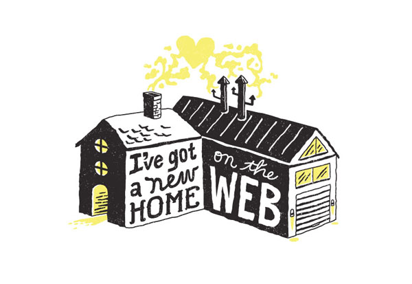
Your style is wonderfully handcrafted, with something of a vintage Midwestern slant. Where do you get inspiration?
Interesting. I’ve never heard of vintage Midwestern so I just now went to look it up! I’ll be honest, I do my best to learn many styles, as I don’t think style is the first thing that a designer should have in mind. However, in my personal work, I keep coming back to wanting to make something with my hands (the default tool) as a way to temporarily relieve myself from using the computer as a primary design tool. It’s produced interesting results, so I’ve played into that over the last few years and pushed it a few different ways.
I get inspired from traveling, spending time in nature, and digging through historic design trends. I’m fond of the French Art Deco movement (especially the typography), the illustrated posters of Henri de Toulouse-Lautrec, paintings of the Impressionist Period, the illustration style of Charley Harper, to name a few. Also, any piece of art made by hand with superb attention to detail imbued with concept always wins me over.
If, in some Freaky Friday-like situation, you could live the life of another designer, illustrator or creative, for a day, who would it be, and why?
If I had to swap, I would choose someone who isn’t a designer or illustrator, just for the sake of diversity. Someone like Galileo — who had a fascinating way of coming up with inventions to get at the root of how the world works. After I saw the museum dedicated to his work in Florence, I was blown away. If I had to pick a designer, I’d go for Herb Lubalin for his typographic creativity or Saul Bass for his conceptual sequences in film. If I had to pick an illustrator, I’d go for Charley Harper for his ability to interpret flora and fauna through geometric structure or Ralph McQuarrie for his brilliant visualizations of the Star Wars universe as the first film was being made. McQuarrie sounds like the most fun, so I’ll say that he is my final answer.
What design tools could you not live without?
As far as physical tools, I can’t be without my Wacom Intuos tablet. It’s changed the way I work over the last few years, and it’s so much more natural than a mouse. I also carry a Moleskine notebook and Micron 05 pens around with me most of the time. All other tools seem to shift with the times, with the exception of Illustrator, which I’m so fond of as I’ve learned many shortcuts and specific methods of production.
I would also add that I don’t think I could work these days without my previous design experiences or my trusted group of peers, which are almost more important to me than the physical tools.
And finally, what tips would you give to anybody who is looking to get started in design?
Sure! Here are a few bits of advice that might benefit folks who are just starting out:
1. Be nice to everyone. To the extent that I think it’s a pre-requisite for making good work, because what you make takes on your attitude and perspective. Since we’re all in this together, a little kindness goes a long way to building the sort of community that I think we all want to be a part of.
2. Start personal projects that force you to experiment with new skills and design thinking. Make things people want and share the process (and final product). Let yourself ‘fail’ to some extent with these projects, as you’ll get the best education from the time invested in them.
3. In digital, explore the contextual user experience (UX) before designing any user interface (UI) elements. It’s too easy to go down a black hole of endlessly tweaking interface visuals until they look beautiful, but you can miss the purpose and intention of your digital product in doing so.
4. Start (and keep up) a blog that tracks the evolution of your design thinking and demarcates when you finish projects. Don’t stop posting to it. Over time you’ll see the journey that has shaped how you work and think, which is extremely valuable.
5. The internet is full of resources for DIY education. Set a schedule for yourself to learn a new skill or approach on a monthly basis, and stick to it.
6. Don’t over focus on design. Go out and see the world, read often, and make friends that you can trust to support you. Design is not the only thing in life.