One Minute With…
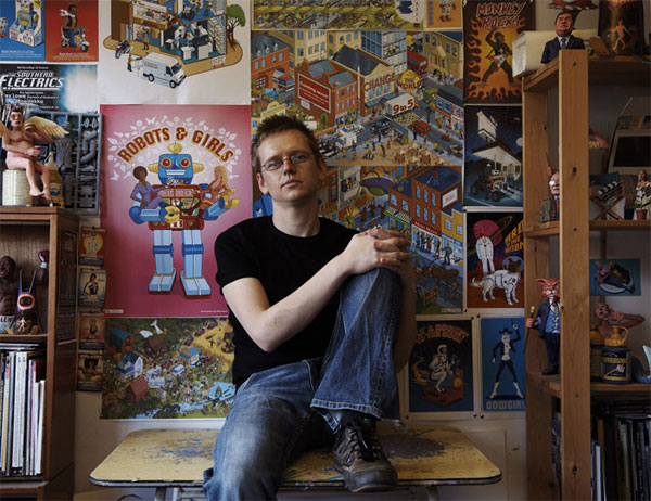
Rod Hunt
Hi Rod, thanks for taking time to chat with One Minute With. Tell us a little bit about yourself and your work.
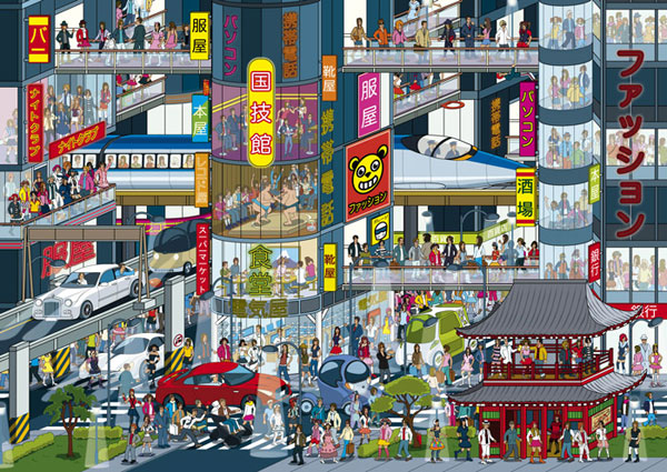
I’m a London based Illustrator & artist who has built a reputation for retro tinged Illustrations & detailed character filled landscapes. With UK & international clients spanning publishing, design, advertising & new media, I’ve illustrated everything from book covers to advertising campaigns, installations and iPhone Apps. I’m also the illustrator behind the bestselling Where’s Stig? books for the BBC’s hit TV show Top Gear.
I’m currently also the Chairman of the Association of Illustrators. The AOI was established in 1973 to advance and protect illustrator’s rights and encourage professional standards
Walk us through a typical day in the life of Rod Hunt.
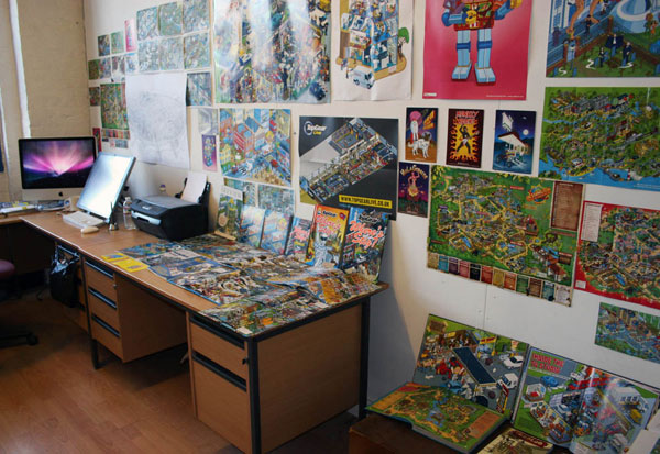
Up at 8.30am for half a gallon of black coffee, followed by a walk or bike ride to my studio at Second Floor Studios & Arts by the Thames Barrier & I’m usually in by 10am. Fire up the Mac & go though the first emails of the day, & deal with any over night inquiries.
If I don’t have to get straight on a job for a looming deadline, I’ll probably doing a bit of promo – maybe updating the blog, website, Flickr or an online portfolio. After that it’s heads down on the current job until 1pm when I’ll stop for lunch. Maybe I’ll get out of the studio and go and sit on the Thames river wall to get a break from the studio for a few minutes. Possibly I’ll do some reading back in the studio & catch up with design news. I think it’s important to be very aware of what’s going on in the wider design world beyond what your doing – you never know when that information might be useful or lead to discovering a new potential client.
Then it’s back to work at 2pm, before a tea break around 4pm where I might meet up with some of the other illustrators on site at the studios. Then a final stint until I leave for home, hopefully before 7.30pm. Have some dinner & try to switch off from work, though I might have to deal with an inquiry from my US agent in New York, or take a conference call with a client on the West Coast.
How did you get into illustration and design?
Comics were my big passion as a kid & the reason I was inspired to draw & eventually choose a career as an illustrator. After graduating from the Cambridge School of Art at Anglia Ruskin University, I spent 2 years living in Nottingham working on my portfolio & starting to get my work seen by clients to gain commission. Eventually it got to the point where I moved to London so I could go full time.
I graduated in 1994, which was pre Internet portfolio days, so I sent potential clients sample postcards & visiting London to pound the streets with my portfolio. Pretty much all my work was for newspapers & magazines to start with.
Once I moved to London in 1996 I used to do two mornings a week every week with my portfolio seeing clients, doing in excess of 120 meetings a year. It built from there. Then everything changed with the advent of the internet, & I decided I had to change with it. In 2000 I taught myself web design to create my first website & in 2001 I completely reinvented my work, abandoning paint & mess for a Mac & Adobe Illustrator.
How do you approach a new project? What’s your creative process like?
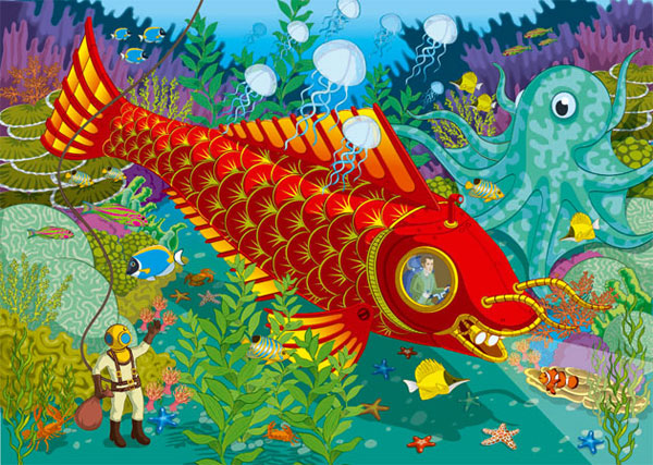
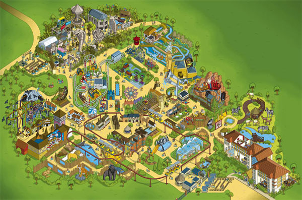
Once I’ve read the brief, maybe I’ll have a chat with the Art Director & start formulating ideas. There’s often a lot of research that has to go in to each piece, especially for something as complex as a theme park map. I always start by doodling ideas and compositions in an A5 sketchbook with a pencil or biro. These are very quick and throwaway. I don’t get stuck into the detail at this stage & purposely draw with a biro so that I can’t erase anything, keeping away from detail to keep the ideas flowing.
Compositionally. it’s important to have flow through the piece, leading the eye on a journey. The piece has to work as a whole & not look like the sum of its parts or be disjointed. It’s important not to be seduced into the detail too soon & lose sight of the the overall goal. I also need to give myself enough thinking & doodling time at the beginning of a project before producing a finished rough drawing. That’s where the real hard work is done & is the foundation of a great piece of work.
After I’m happy with the very rough spread compositions, I moved onto creating a detailed fully finished pencil rough, drawing with a 2B pencil on heavyweight cartridge paper. It’s at this point I work out the amount of detail in the piece.
The roughs are then scanned & used as a guide in a background layer in Adobe Illustrator to produce the final artwork. After using a normal Wacom tablet for quite a long time I decided to invest in a Wacom Cintiq to help with the work flow & speed things up. It was a pretty wise investment as drawing directly onto the screen made things much more natural & intuitive. I tend to use Illustrator as a straight drawing tool & use effects sparingly, aiming to keep the hands on feel with my work, despite producing the final artwork on the computer. At the end of the day the computer should just be seen another way of making a mark on a page. Everything is broken down into many layers to I can keep track of all the detail & make things easily editable for myself.
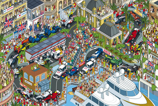
You are best known for your highly-detailed isometric illustrations – Was it a conscious decision to find a style you liked and stick to it, or did it simply end up that way? How has your style developed over time?
I never set out to work in this way, but it’s something that has evolved organically over time. I started creating isometric work at art college, where I painted with fat hogs hair brushes & acrylic paint on paper. After I gradated in 1994 & started working towards getting commissions, some of this work was part of my portfolio. My second ever commission, which was for New Statesman magazine in 1995, was isometric.
The next big leap forward was when I reinvented my work in 2001 by going completely digital, changing over to working in Adobe Illustrator. Lads mag Maxim asked me to create an isometric lingerie shop which helped me to develop my new digital isometric language. This then lead to more commissions & refining the style. The book cover for Change the World 9 to 5 in 2006 then started me on the path of much more complicated scenes & cityscapes, the culmination of which has been Where’s Stig? which took the detail & sophistication to a whole new level. All along I’ve followed where I saw an opportunity & what I was having fun doing.
You’re currently Chairman of the Association of Illustrators. What do the AOI do, and what is your role in that?
I Chair the AOI’s Board of Directors, who are responsible for ensuring good governance & the strategic development of the company. It’s an unpaid voluntary role & can sometimes take up a considerable amount of my time. But I’m a passionate believer that we are stronger working together to protect & develop our industry through the AOI than working as individuals. The AOI has helped me develop my career, so I also feel that it’s important to give something back to help develop the organization for the future, support other illustrators & ensure the sustainability of our industry.
I feel being a member of the AOI is a vital part of a professional illustration career. Being freelance can be a bit isolating & being part of the AOI can give you a sense that you’re not alone in this, you’re part of a community & you know where to get professional advice. With pricing, contracts, copyright & business development it pays to get advice from the professionals, & that is just one phone call or email away by being part of the AOI.
They’re there to help with all aspects of advice & developing your creative career. The AOI also puts on regular industry events, runs Images – The best of British Illustration competition & publishes the award winning Varoom magazine.
What design tools could you not live without?
These days I couldn’t do without my iMac & Wacom Cintiq screen tablet. My Cintiq was probably my biggest indulgence of the last few years, but has definitely been a wise investment.
And finally, what tips would you give to anybody who is looking to get started in design or illustration?
Get out there and get your work seen by as many people as possible. You should never be afraid to show people your work. It’s important to invest enough time & resources in promoting your work & explore all possible markets. You maybe the best designer/illustrator in the world, but if no one sees your work, you won’t get commissioned
Be yourself & indulge your personal interests in your work as that is what will set you part form everyone else.
Perseverance. It can take quite some time to get really established.
It’s vitally important to educate yourself about the business side of things. Understanding pricing, copyright, contracts, etc is just as important as the drawing if you want to be successful & sustain your career for the long term. I’d recommend joining the UK Association of Illustrators (AOI). They’re constantly campaigning to protect all illustrator’s rights, and if you need advice on pricing commissions, contracts, promotion, developing your career, etc, it really pays to get help from the experts.
Maintain control over your Copyright in your illustrations. There are very few occasions that clients need to own the Copyright in your work. Your body of work is your livelihood, and you should be entitled to the financial benefits of your talent and hard work.
Thanks Rod!
Many thanks to Rod for sharing his thoughts with OMW. I genuinely had a lot of fun interviewing him, and I hope you love the interview as much I do!
Why not check out Rod’s site, and follow him on Flickr and Twitter?