One Minute With…
Tyler Galpin

Hi Tyler, thanks for taking time to chat with One Minute With. Tell us a little bit about yourself and your work.
Well, I’m a web and UI designer currently based out of Toronto, Canada. Never went to design school but always had a passion for design and especially the power of the web as a medium for design.
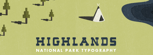
I have a weird duality in my work where my “personal style”, if you could call it that, is best known as being vintage and old-school. On the other hand, I also create what some would call “shiny” interfaces and such, but only where I think it’s appropriate.
I’m really inspired by things of old, and their utility and value that the design provided in places like the United States and Canada
See more of Tyler’s work here.
Walk us through a typical day in the life of Tyler Galpin.
I’m definitely not a morning person, so I usually wake up around 10 or 11 and do the normal things that humans do when they wake up. Usually my first task is to wrangle all the emails I’ve gotten overnight and through the morning – these are usually from people who are, in fact, morning people and can somehow manage to wake up at a reasonable time. Most of the time I have a couple client chats in a day, either via email/Basecamp or over Skype. As a freelancer it’s cool being able to give clients the one-on-one treatment that you won’t usually get with a designer at an agency.
I like sketching my designs before I Photoshop them, so I’ll spend anywhere from an hour to four hours listening to music and getting ideas down on paper. For the most part Photoshop is open all day and I flip from one client project to another whenever I get stuck on a design. I’m a huge procrastinator so it’s important for me to start projects early – my brain needs time to process the various design problems unconsciously. Then it’s either staying up until 4 in the morning working / relaxing, or going out with friends.

How did you get into design?
When I was about 13, about 9 years ago, I got my first laptop (for the record, it was some shoddily-built Toshiba that fell apart til the very end). Being a young male, I for some reason thought it would be cool to “trick my computer out” with custom wallpapers, icons, toolbars – the whole nine yards. This was my first introduction to the DeviantArt scene, and seeing all the awesome abstract wallpapers got me interested in figuring out how to make my own. So I bought Photoshop and began following tutorials online doing pretty basic stuff. After a while I got interested in learning how to make my own website for myself, and things took off from there. I learned CSS from various articles online and looking at other designer’s source code.
That was about 4 years ago that I learned CSS, and from there I just designed a million sites for myself as practice and sorta stumbled into freelancing as a way to make money.
(I still don’t know how to make those abstract wallpapers)
How do you approach a new project? What’s your design process like?
I start all projects with a phone call, where I basically glean some information such as what the client is looking for. Really the point of that call is to find out one thing: what is the message? What does the client want to convey with their logo/website/app? Figuring this out at the start is crucial, because nailing this down means I can deliver on my promise to provide them with the exact design solution they need. Then we move onto a short questionnaire where I scope out what style the client likes design-wise. I find out what colours they prefer and which colours they don’t, existing sites/apps/logos they enjoy, competitor products, their brand message – essentially laying down a blueprint for a moodboard.
My next step is to create this (usually) very deep collection of things that are inspiring me for the project. This consists of websites, logos, photographs – literally anything and everything that has some sort of design value in relation to the project at hand. I find that browsing through places like Flickr is great for finding little details/colours/moods that can help guide a designer through a project.
Sketching is a big part of what I do, so I take all that I’ve learned from the project so far and try to capture it on paper. Most of the time, the first sketch is a basic layout and very simplistic. Then I’ll create a relatively in-depth sketch on the next page with all the design elements. If I think of a cool idea or know exactly how content will look in the finished product, I’ll write it down next to the detailed sketch so I don’t forget about it.
Then I dive head-first into Photoshop and usually start with the design elements that I want to try out stylistically or elements that I have a very clear mental image of. It’s important that if you get a spark of inspiration to create something that you don’t let it go – you’ll thank yourself later for it.
Usually I do a first draft of the design, sit on it for a day, and then review it again. This allows me to see it with a fresh pair of eyes and decide whether I love or hate it. Usually it’s the latter, so I fix up the design as I see fit and by then it is quite polished enough to show to my client.
You’ve been involved in a few high-profile self-initiated projects, such as Lost Type Co-Op and Get To Build. How much of your work is self-initiated projects, and how much is client work? Is there one you prefer over the other, and why?
I would say that I don’t prefer one over the other, but I will definitely admit that self-initiated projects can be among the most rewarding (personally and professionally).
Usually I structure my flow of client work so that I have some “free spots” in my schedule to work on an idea that I have or do upgrades/updates to existing ideas. It’s nice being able to have fluctuations in my schedule like that – helps keep me sane.
Depending on how big the projects are, I usually maintain 5-6 active clients/projects at a time so if I want to spend time on, say, Lost Type, I will just say “no” to a couple prospective client projects.
Clients are important because I need to earn money and make a living for myself – they also open up lots of doors opportunity-wise. Personal projects are important because they are fun, usually benefit a greater cause, and (I would argue) open even more doors to new opportunities because of the exposure alone.
I’ve seen many design blogs including Lost Type fonts in their endless collections of free fonts. Do you see Lost Type fonts as free fonts with the option to reward the author, or as premium fonts with the option to get them for free?
It’s interesting you put it that way. It took me a while to think about this, and dig deep down to find out how I actually view them. My opinion of the fonts in the collection is firmly rooted in our original idea which was to offer “premium” fonts for whatever price the user was willing to pay. Radiohead obviously had huge success with their album “In Rainbows” which allowed people to pay what they wanted for the entire album. They had spent months and long hours creating this premium piece of art, and pulled a risky move (that ended up paying off). I would view the fonts at Lost Type in the same vein in that all of the designers have put in huge effort into making their respective font(s) – thereby the “premium” moniker. If we take a step back and look at various other industries like the music industry which suffers from widespread piracy due to the DRM that the labels use, we see that people will “steal” content regardless of what you do. We figured that if we made everyone pay for the fonts, the TTFs/OTFs would just get shared and pirated anyhow. By making them free with the option to donate, we eradicate the idea of pirating in one fell swoop.
You mentioned that you listen to music a lot whilst sketching. What’s currently on your iPod/iTunes/Playlist/Zune?
I listen to lots of different types of music – techno, classic rock, hip-hop, jazz. Pretty much anything and everything except country or opera. When I’m designing I am usually listening to techno/trance/house because the solid beat is a pretty great motivator. Sometimes it works too well and I have to go take a drive or step away from the computer. I discovered at a very young age that my brain works best when I have lots of distractions and white noise going on around me, so music is a huge part of my life and you can find me listening to it all day.
What design tools could you not live without?
Software:
– Photoshop CS5 (for designing)
– Espresso (for development)
– Transmit (FTP)
Hardware:
– Magic Mouse
– 27″ iMac (the extra screen real estate is key)
– iPhone (it’s handy for viewing iOS mockups)
– Field Notes (perfect for writing down ideas on the go, and for notes from phone meetings)
– Duller Notebook (great for sketching)
– MUJI pen (I am convinced that this is the perfect pen – super cheap and feels great in my hand)
And finally, what tips would you give to anybody who is looking to get started in design?
1) Practice, practice, practice.
If you don’t have any active clients or don’t know where to get started this is the perfect opportunity to learn and hone your skills. Make fake websites for yourself, redesign other websites, and tear them down only to rebuild them again. You will benefit from not only experimenting with things like typography and layouts, but will also become better/faster/stronger at your Photoshop/Illustrator/Fireworks skills.
2) Learn.
Visit sites, look at logos, and play with apps that you know are exceptionally done. The easy part is recognizing good design. The hard part is fundamentally understanding *why* it is good design. Why does x element work in x design? Does it add to the design, or does it add visual noise? Figuring out the answers to these types of questions and being able to support your answers is a huge step towards growing as a designer.
3) Karma
I admittedly preach about this a lot, so sorry if you have heard this from me before. I still feel it is probably one of the single most important things to consider not only as a designer, but as anyone in any profession. Be nice to people. Respond to emails/@replies. Even if they aren’t a super important person. *Especially* if they aren’t a super important person. That 15 year-old kid who is asking you some “silly” questions about CSS might be the next Big Thing. You won’t remember them, but they will remember for a long time whether you helped them or not. You get one chance at a reputation, so don’t screw it up.
Thanks Tyler!
Many thanks to Tyler for sharing his thoughts with OMW. I genuinely had a lot of fun interviewing him, and I hope you love the interview as much I do!
Why not check out Tyler’s site, and follow him on Dribbble and Twitter?
1 Comment
Colin Harman
Genuinely fun to see his thoughts written out. He’s been creating some great stuff and I’m thankful to have been a beneficiary of his work at Lost Type. Thanks forever.