The Perfect Design
Portfolio Site

I know, I know, this ain’t one of those interviews that you all know and love, but I thought I would share a few tips that I have picked up whilst doing this blog. So, y’know, enjoy. If you really hate the fact that there’s a long-form article on the site, just write me a strongly worded letter. I’ve always wanted to receive a strongly worded letter.
Hey there. I’m Conor O’Driscoll. You may not know me, but I’m behind all of this. I contact all of the interviewees. I ask all the questions. I get all of the images for the posts.
Because of this, I look at a lot of designers’ portfolios. And when I say “a lot”, I mean a lot. For every one interview you see on this site, I’ll have looked at 4 or 5 portfolios. For every 4 or 5 portfolios I look at, I e-mail 2 or 3 designers. And for every 2 or 3 designers I e-mail, you get one awesome interview!
There are various reasons as to why I don’t contact someone after looking at their work. Most of the time, it’s nothing to do with how good their work is. Most of the time, it’s to do with how good their website is.
In this post, I’ll run you through some of the best and worst practices to make sure your site is good enough for me to contact you. Because after all, I’m a designer, just like you – I’m used to this sorta thing. So if I won’t contact you, what chance do you have with clients?
10 Handy Tips to Growing a Better Portfolio Site
So without further ado, here are my tips to having a workable portfolio site:
Actually HAVE a personal site.
I guess we’ll start with the basics. When I follow the link to your site on Twitter or Dribbble, I don’t want to find myself at the site of the agency that you and your friend set up, however great it may be. I want YOUR site. A site where I can send an e-mail and be 100% sure that it’s you who will receive it: not your business partner, not your secretary, but YOU. You’re a human being, so try and make that clear on the web too.
If you have to link to your business, at least have a personal e-mail in there somewhere, so I can e-mail alfredo@awesomeawesomeawesomedesignco.com, rather than just info@awesomeawesomeawesomedesignco.com.
Have your work on there.
I see this far too often. You’ve got this lovely little site which sells you as a fantastic designer and a great guy and the sexiest man on the planet, and there are social media links and e-mail buttons and it looks fantastic, but… there’s, uh, no work on there. I mean, sure, there’s a Dribbble link, but I’ve come here to check your work out, I don’t want to have to go somewhere completely different. At the end of the day, you’re being hired on your work, so you might as well show it off.
Use big images.
I guess this one is really only for interviews and bloggers, but still important. Most blogs like to use nice big images for their posts. Here at OneMinuteWith, my images are 600px wide. Dribbble shots just don’t cut it, unfortunately. Images that are too small is a problem, but images that are too big really aren’t, as long as you can maintain a small enough file size. Live on the wild side: Chuck a few 1000px wide images in there – Bloggers like me will thank you for it.
Make it easy to contact you.
I can’t stress the importance of this. The primary goal of your site is almost always to get people to contact you, whether it’s clients, fans, or annoying interviewers like me. If it’s a struggle to find your e-mail address, I won’t bother – There are plenty more fish in the sea, why should I waste my time trying to catch this particularly awkward fish?
Chuck a mailto: link in there.
Having a contact form is all fine and nice and pretty and show-offy, and by all means, include one, but also give me the option of clicking a link that will open up my mail client and I can compose a message on my own terms. I send out a lot of e-mails to interviewees, and it’s a lot easier to keep track of a few e-mails in my Sent folder than having to remember whose site I’ve visited, and out of those, who I’ve actually contacted. Similarly, most clients send out a load of e-mails to a load of designers, and they’ll probably want the same level of organisation.
Social media, social media, social media.
Your clients aren’t Luddites who don’t understand the internet. Or at least, not all of them are. Many of them will want to connect with you on LinkedIn, or see what you’re saying on Twitter. As an interviewer, I know I always check someone’s Twitter before e-mailing them – It can be an incredibly useful way to gauge their personality quickly. As a freelancer, your social presence is your best asset, so please, for your own sake, exploit it like crazy.
Dribbble is your friend.
You’re a designer. You’re busy. You haven’t got time to update your portfolio every single time you churn out another retro hipster logo. What you do have time for, however, is to post it on Dribbble, get 100 likes and have everyone say how awesome your work is. Many clients, by now, know what Dribbble is, so put a link on your site to it, and you’ll only have to update your portfolio every 6 months. Everybody wins.
Just be human.
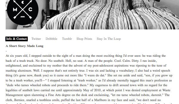
You’re a designer. You are in one of the most creative professions in the world. You’ve got hundreds of ideas swimming through your head all the time. You are an absolutely fascinating person. Judging by your portfolio, however, you’d never be able to tell. Don’t be another HTML/CSS/PS/AI bot, be someone interesting. Be funny. Tell stories. Open up a bit. Clients want to work with a human, and interviewers want to interview humans. So please, please, please, just be human.
Include an image of yourself.
This sorta ties in with the bit about being human. You can write as many words as you want about yourself, but there’s something about a photo of yourself that can say something that words never can – It can make that connection that will seal the deal for you. It proves that you’re a human. It proves that you at least exist.
Unless, of course, you happen to be Visual Idiot. In that case, just stick an animal head on a stock photo and call it a day.
Simple is fine.
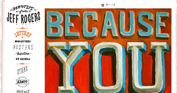
If you’re not a web designer, that’s cool. Just because you’re make pretty posters doesn’t mean you have to make pretty websites too. Don’t get scared and not make a site just because it’ll never be as pretty as WebDesignerX’s site. Just hop on Indexhibit, throw together a website, and let that be that. If anything, simplicity is a good thing – A simple white interface will make your actual work stand out better. So if you have a good portfolio, there’s no excuse for not having a good portfolio site – Go make one now!
A Disclaimer
“But Conor,” I hear your roar, “Your site hardly follows any of these rules!” Yes, I know – I did, after all, write that heckle. But my site isn’t the perfect portfolio site. By a long stretch. Also, I’m not really trying to get freelance work from it, nor do I particularly want to be interviewed. But if you are trying to get client work, then implement these tips, and you’ll go far, kid.
Your thoughts?
I’ve been rambling on for hours, but now I want to hear your opinion – Are my criteria fair? What else do you feel is essential to making the perfect portfolio site?
Now, if you’ll excuse me, I’m off to register www.awesomeawesomeawesomedesignco.com…


4 Comments
Jeremiah Wingett
Thanks for the tips Conor. I have a contact form, but I didn’t think it was necessary to add an email link until I read your article. It makes total sense now. I’ll be adding it soon!
Conor O'Driscoll
Glad they were of some help! Looking at your site again, that’s pretty much the only one of my tips you haven’t got (Not that my list is an exhaustive one, but still…) – Again, really great job on that site!
Wendy
This post came as a blessing. Thank you for reminding me about these tips. I actually knew all of them and I keep telling myself that my website doesn’t have to be the best website in the world.
Another tip I keep telling myself: your website doesn’t have to be finished. Your website is never finished. Keep updating your website and don’t bother putting all of your ideas online at once. Start with the basics like portfolio and about pages. If you have some ideas still swimming around in your brain…let them swim until the idea unfolds on it’s own until you are sure you want to put it online and you know how and where.
I have this problem right now: I have a lot of ideas about my portfolio, some design packages…and ideas for other design related stuff and I keep on getting new ideas every week or so…and I have the urge to put them ALL online at once because I am afraid my website isn’t finished…I don’t need to be afraid…I just need to accept that it’s a work in progress. :)
I will work on my website now. Kicking my ass.
Nat
I am in the middle of building a portfolio site, and as i was learning some basic jQuery, i stumbled onto this site, and i have to say thank youuu, haha. Certain tips you have provided never crossed my mind, such as providing the option of opening the viewer’s mail client and dribble. I appreciate it